
ADAC Automotive is a tier 1 automotive supplier and OEM partner based in Grand Rapids, MI. In an industry built on pushing the envelope, ADAC made a reputation for themselves on reimagining what’s possible. Their mindset is simple: tackle new challenges, think new ideas, and manufacture parts that solve new problems.
YEAR
2023
STUDIO
Driven Creative Supply Co.
INDUSTRY
Automotive
Manufacturing
Branding
Graphic Design
ROLE
ADAC began in 1975 as one of the first manufacturers of injection-molded parts in West Michigan. By 2023, they had solidified themselves as a leading tier 1 automotive supplier who specializes in vehicle access systems. However, they offer a wide range of services and capabilities beyond just the humble door handle. ADAC can assist their clients at any point during the project lifespan, from ideating design and engineering solutions at the start to testing and finishing products. Their mission was to break out of the mold of what they’re expected to be and become known as a company that turns never-thought-possible ideas into reality. Through technology, precision engineering, quality, and dependability, ADAC solves for next.
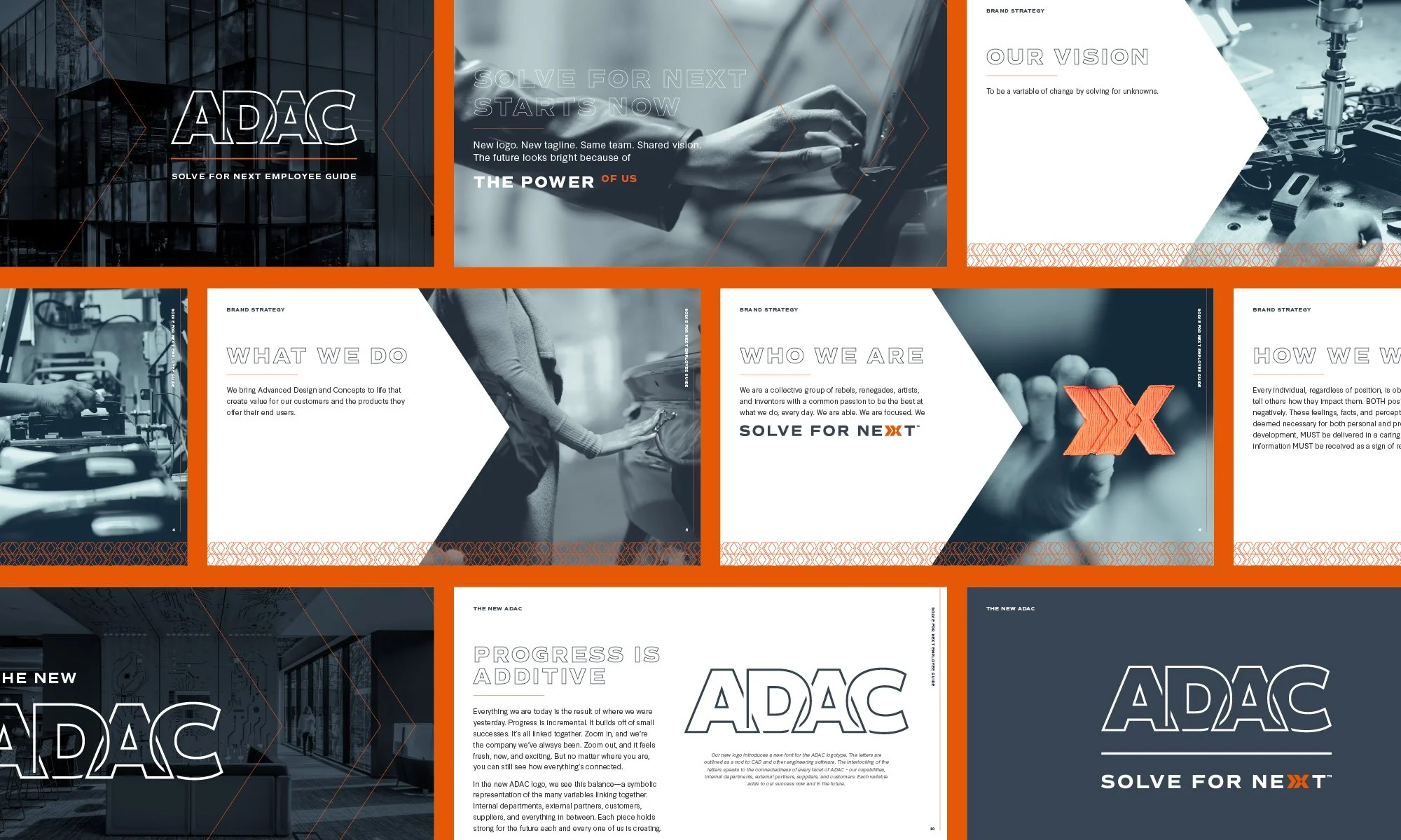
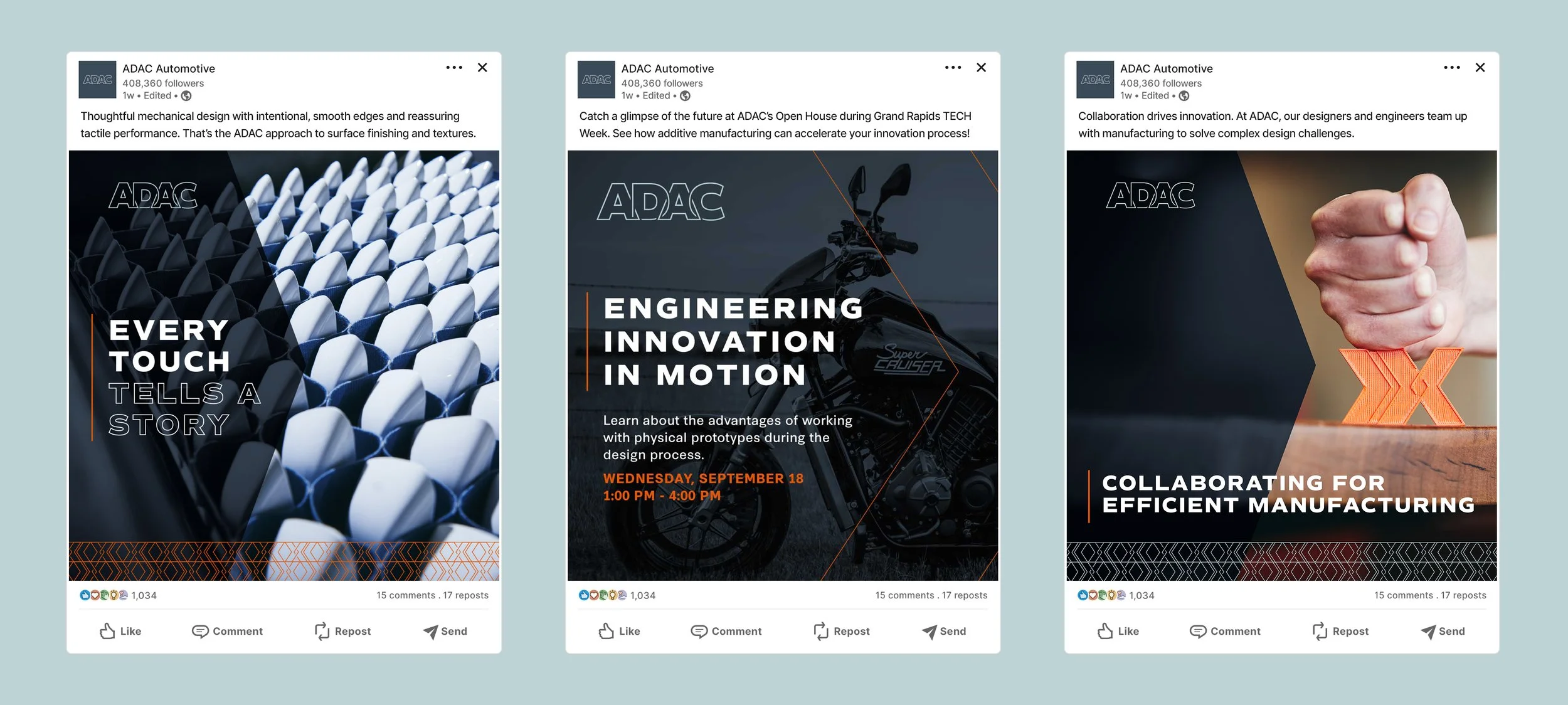
ADAC’s new visual identity is rooted in their expansive services and capabilities. The result is a holistic brand that differentiates ADAC from other automotive manufacturers and positions them for future growth.
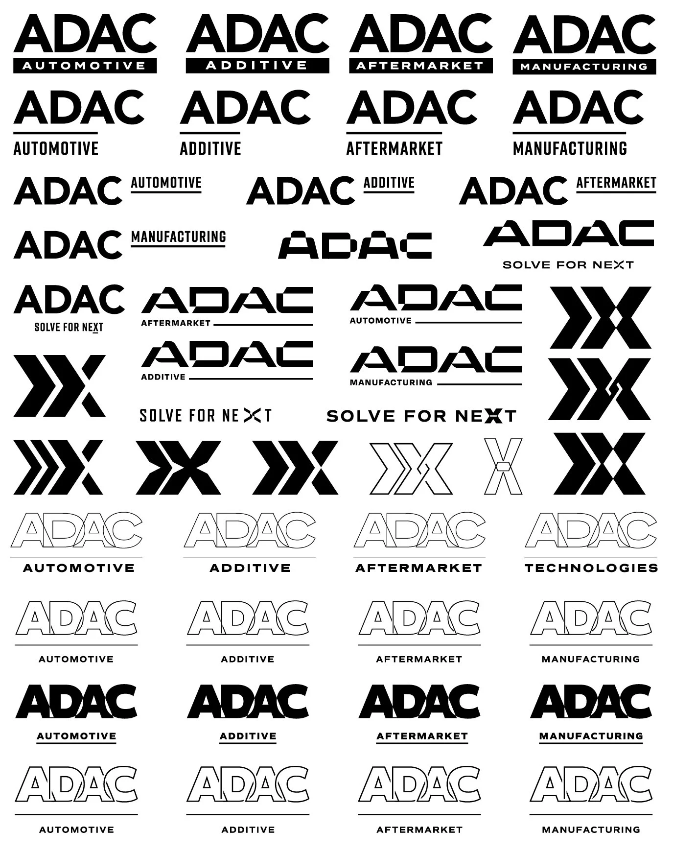
The logo exploration was vast, covering the whole “mild-to-wild” spectrum. There weare options that modernized their existing logo, options that visualized their new positioning of “solving for the unknown",” and options that were inspired by engineering and CAD software.
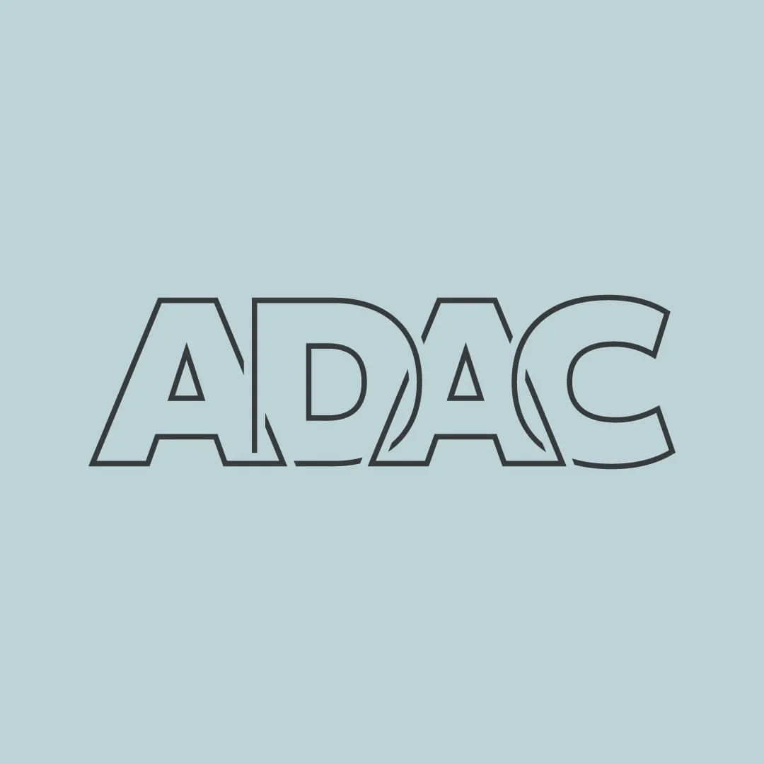
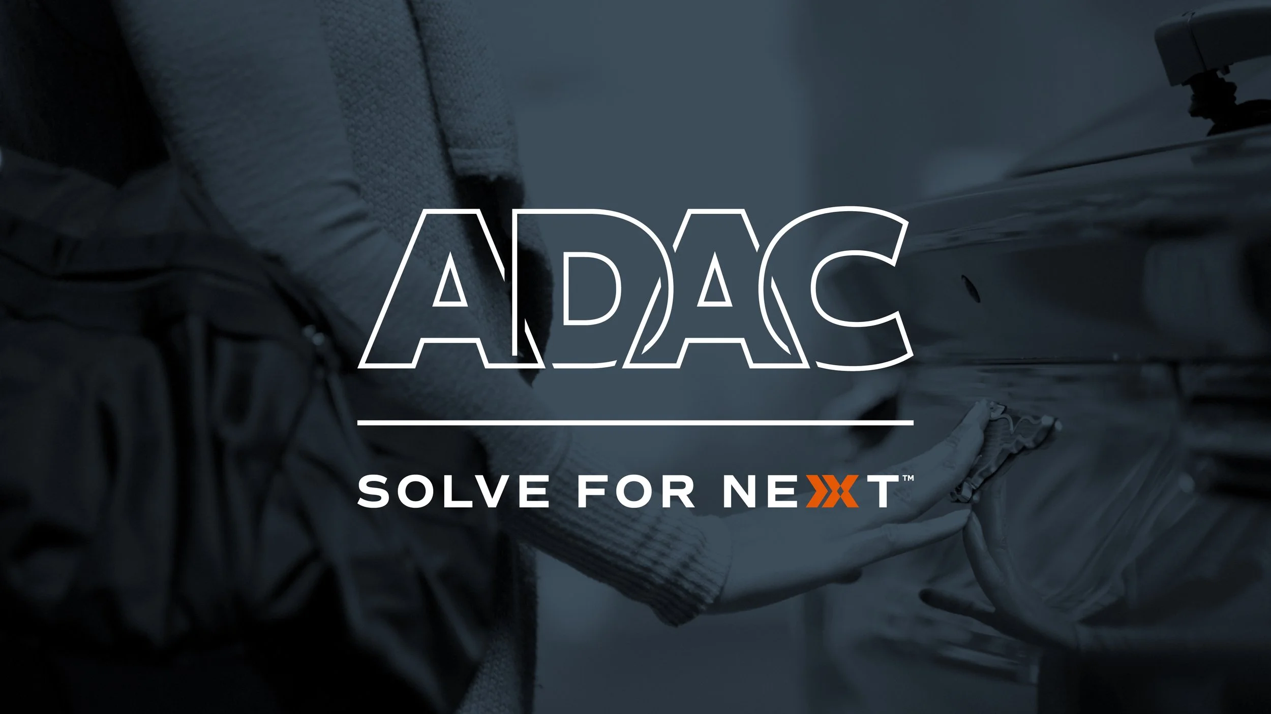
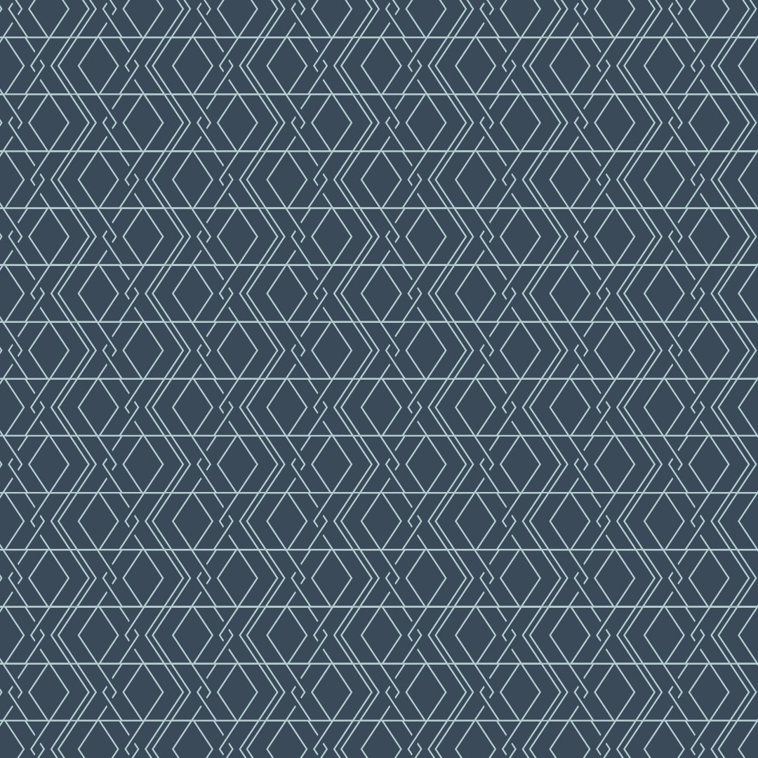
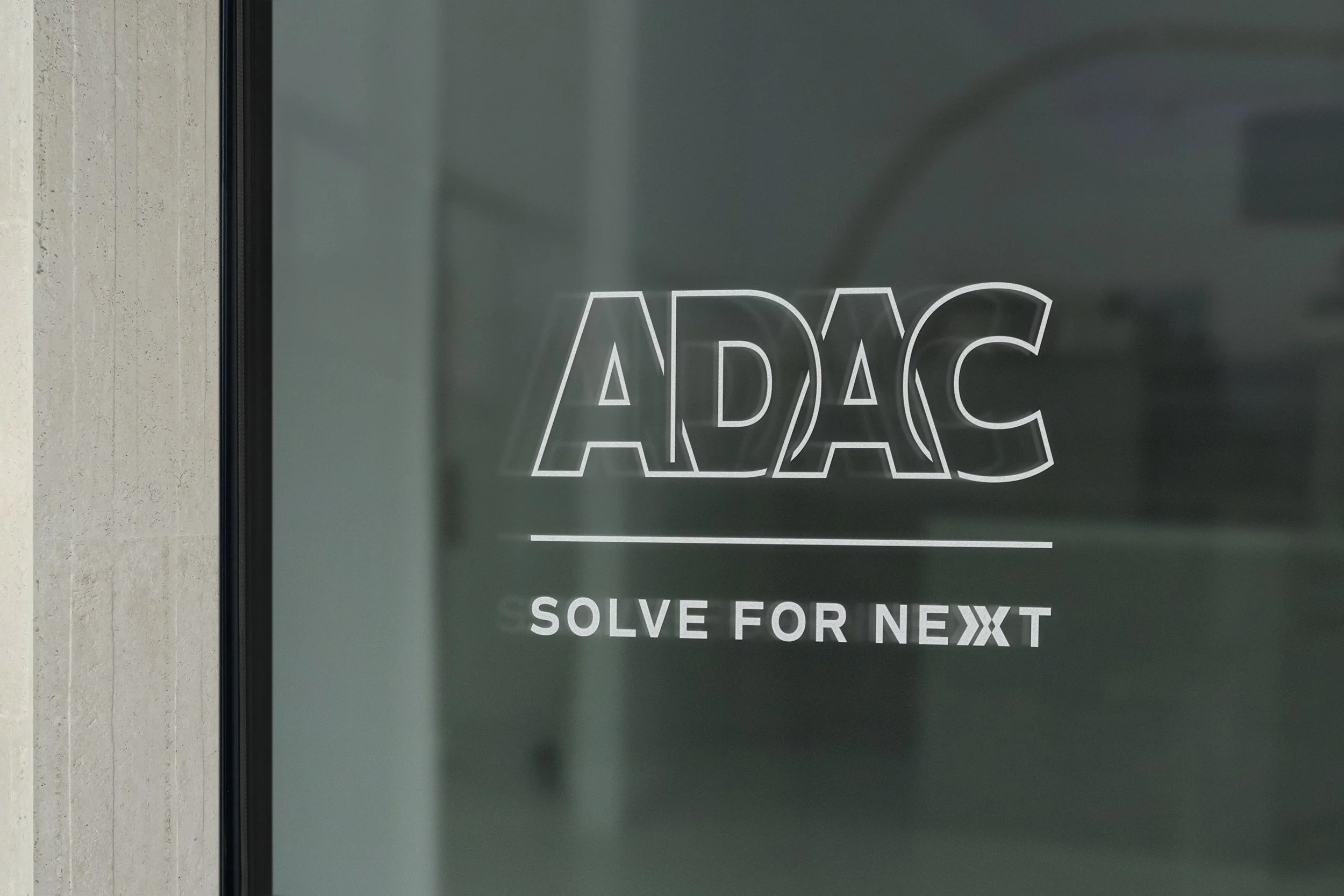
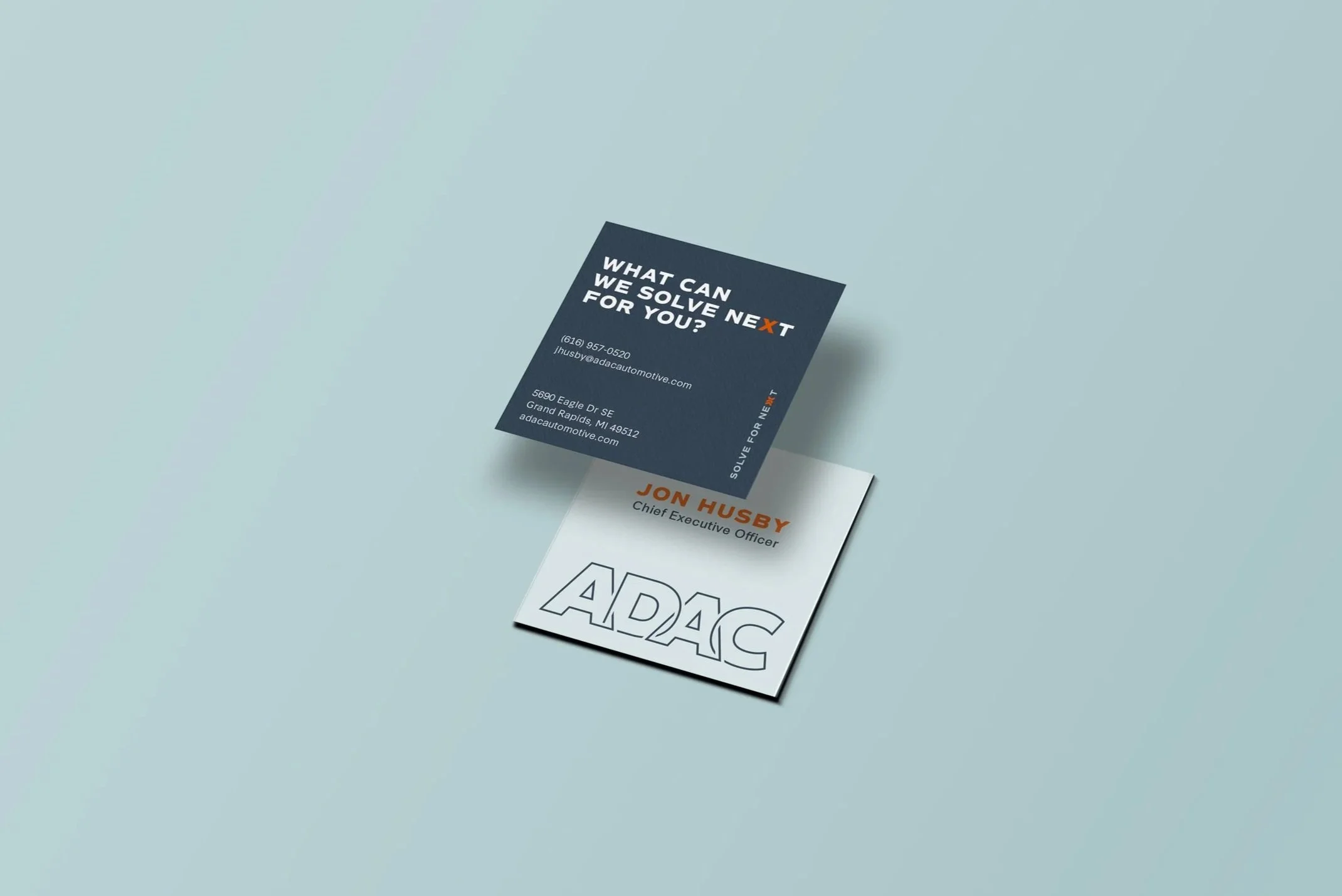
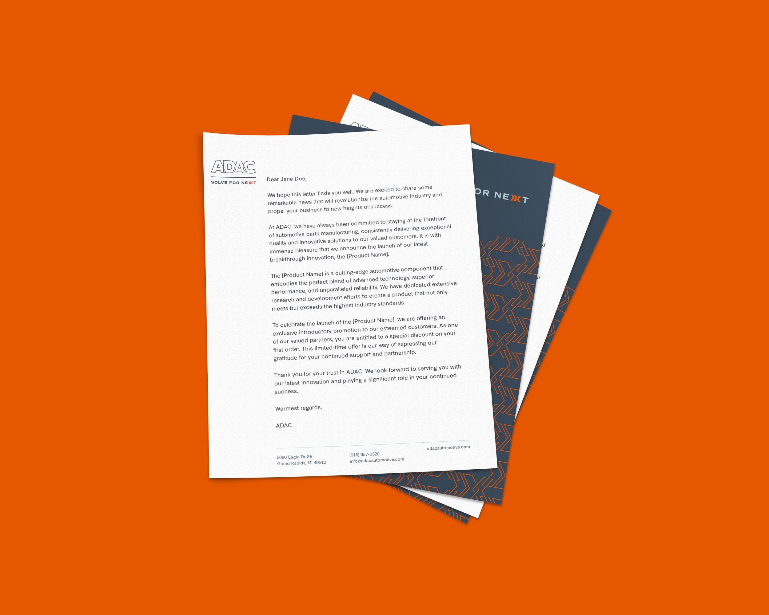
The ADAC logotype is a modified version of Commuters Sans by Dharma Type. The letters are outlined as a nod to CAD and other engineering software. The interlocking of the letters speaks to the connectedness of every facet of ADAC: capabilities, internal departments, external partners, suppliers, and customers. Each variable adds to ADAC’s success now and in the future.
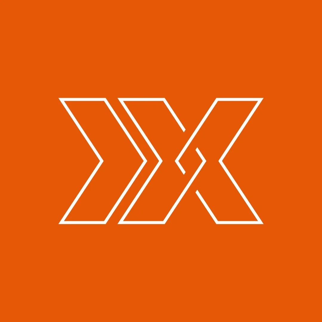
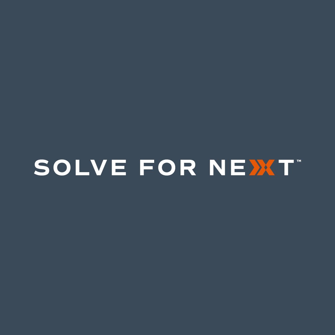
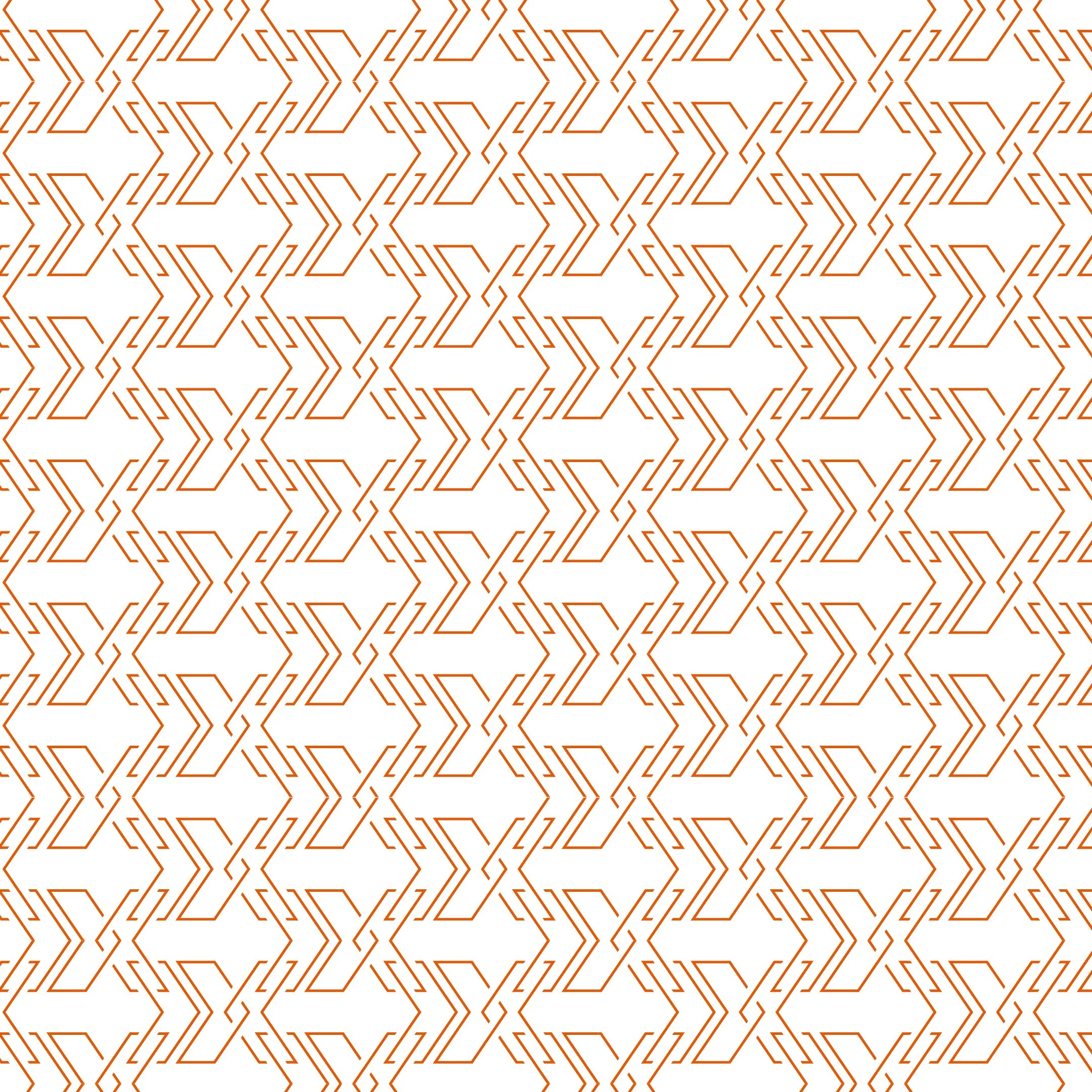
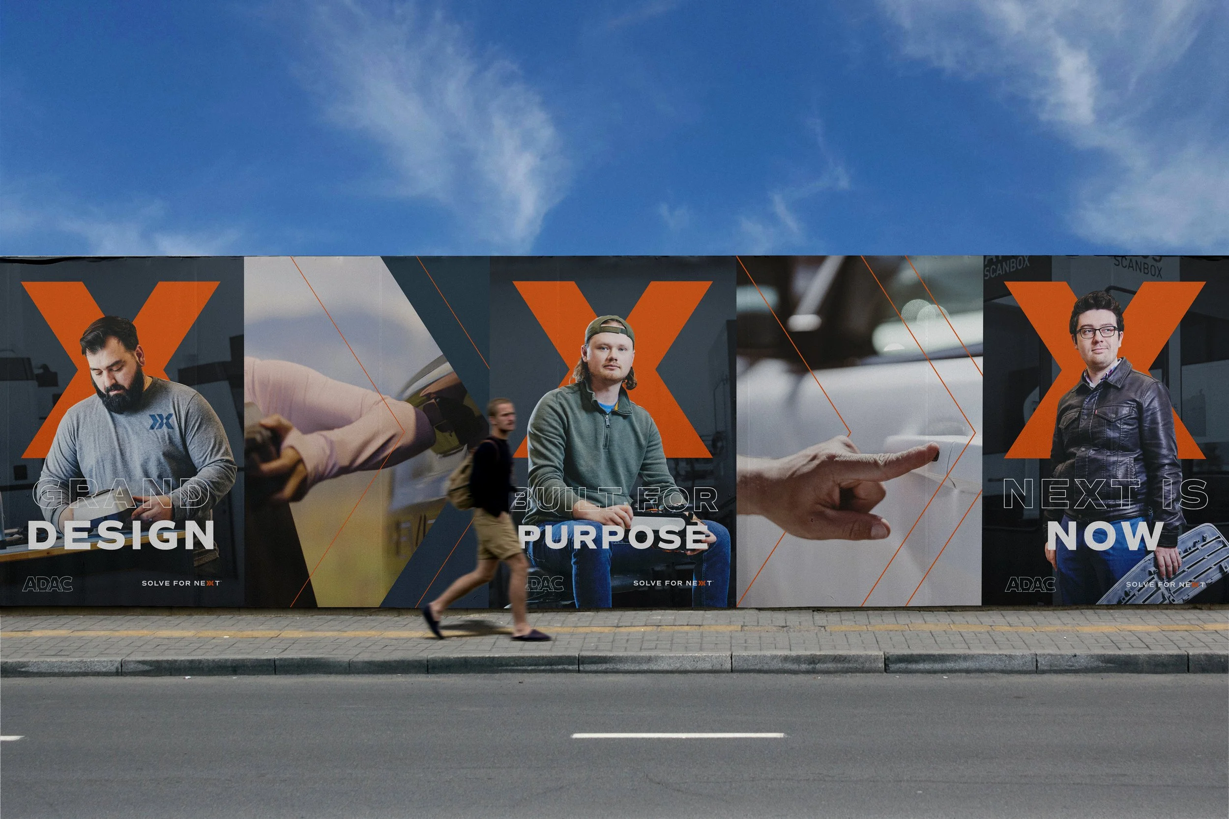
The ADAC X icon is constructed using arrows, which interlock to continue the symbolism from the new logo. The icon also contains two forward-pointing arrows—reminiscent of the ‘fast forward’ icon—to imply forward progress, speed, and the future of solutions they strive to create.


© 2025 Kirsten Schwenzer. 100% H.I. (human intelligence) powered design. 👩🏼💻