In 2018, Bell’s Brewery brewed up a hazy IPA crafted to be easy drinking and capture the taste buds of modern drinkers. The team at Driven named it “The Official”—to be the official beer of good times. The label needed to feel just as confident, bold, and eye-catching.
YEAR
2018
STUDIO
Driven Creative Supply Co.
INDUSTRY
Liquor
ROLE
Packaging
Lettering
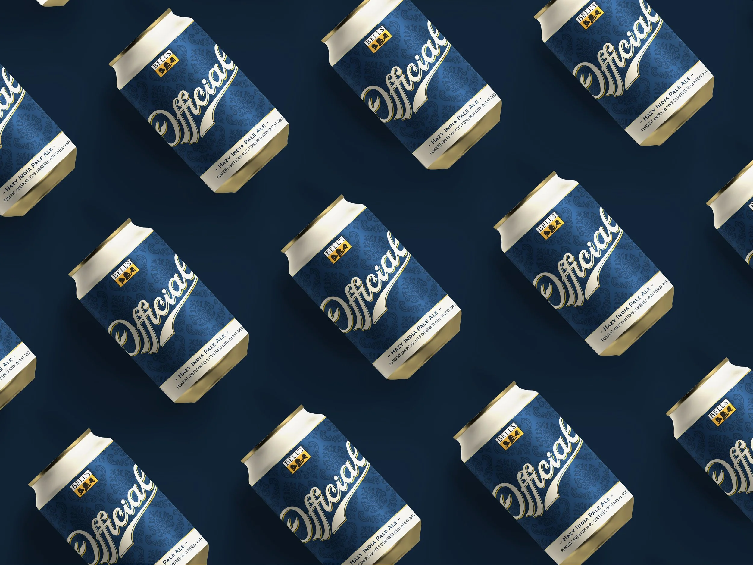
A name like “The Official” leaves big visual shoes to fill. We wanted the label to stand out on store shelves and command attention. During brainstorming, we turned to vintage beer cans for inspiration, specifically for typography and color. We felt the timeless design of these cans evoke craftsmanship, tradition, and quality. We wanted “The Official”’s label to embody those same characteristics.
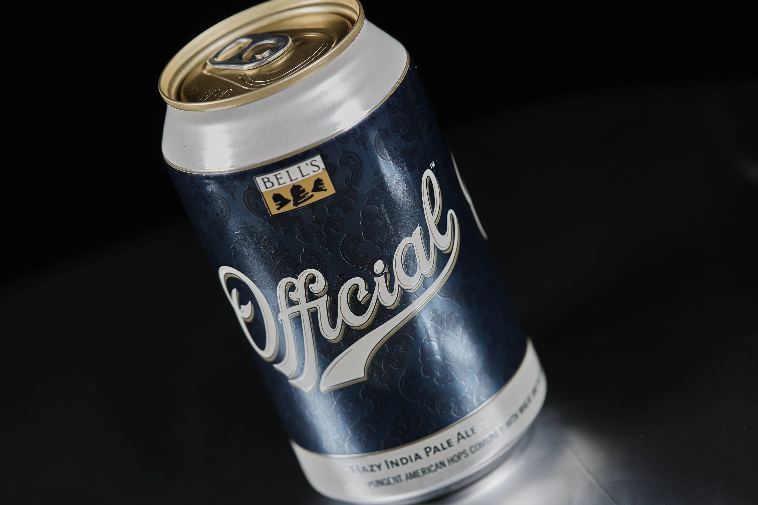
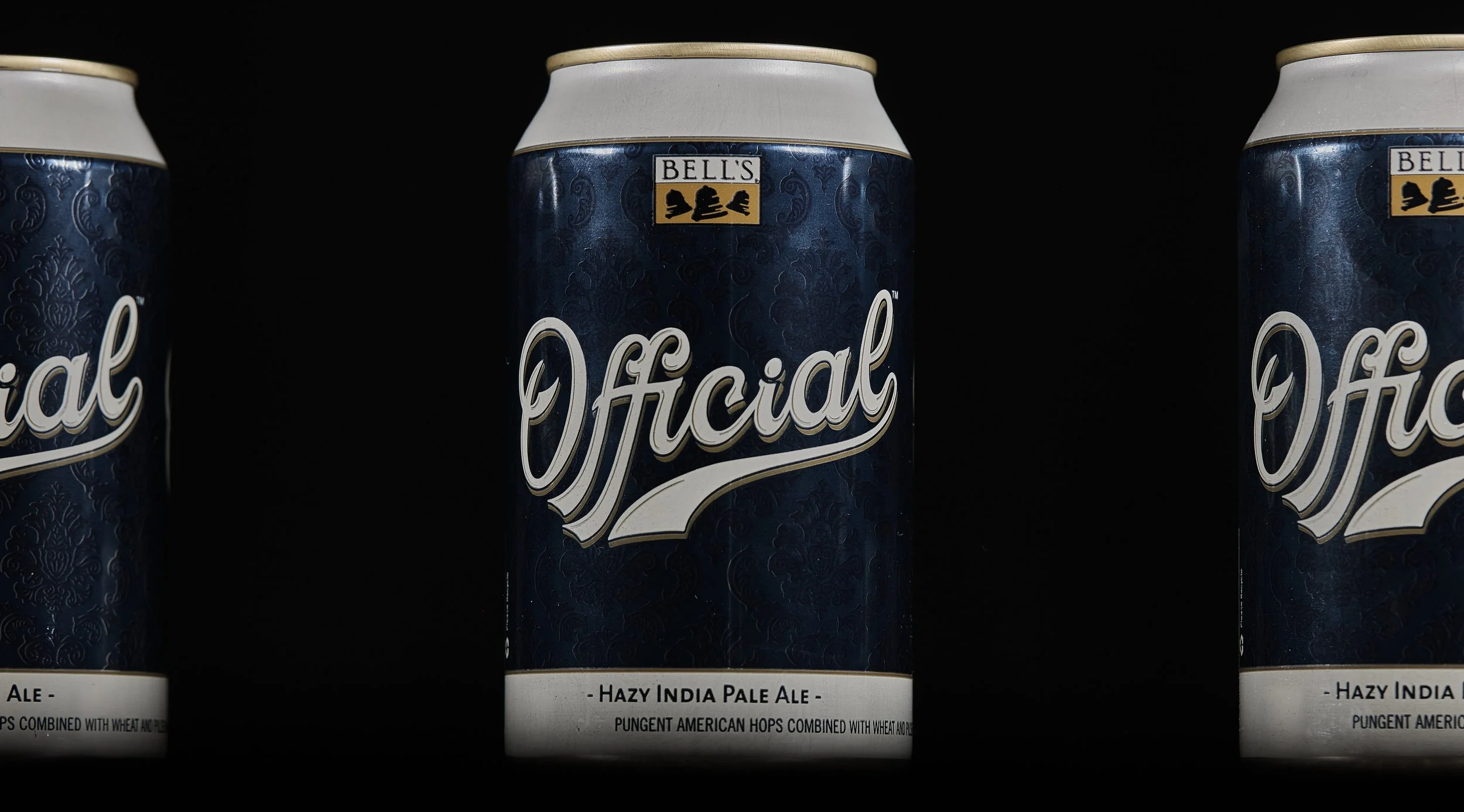
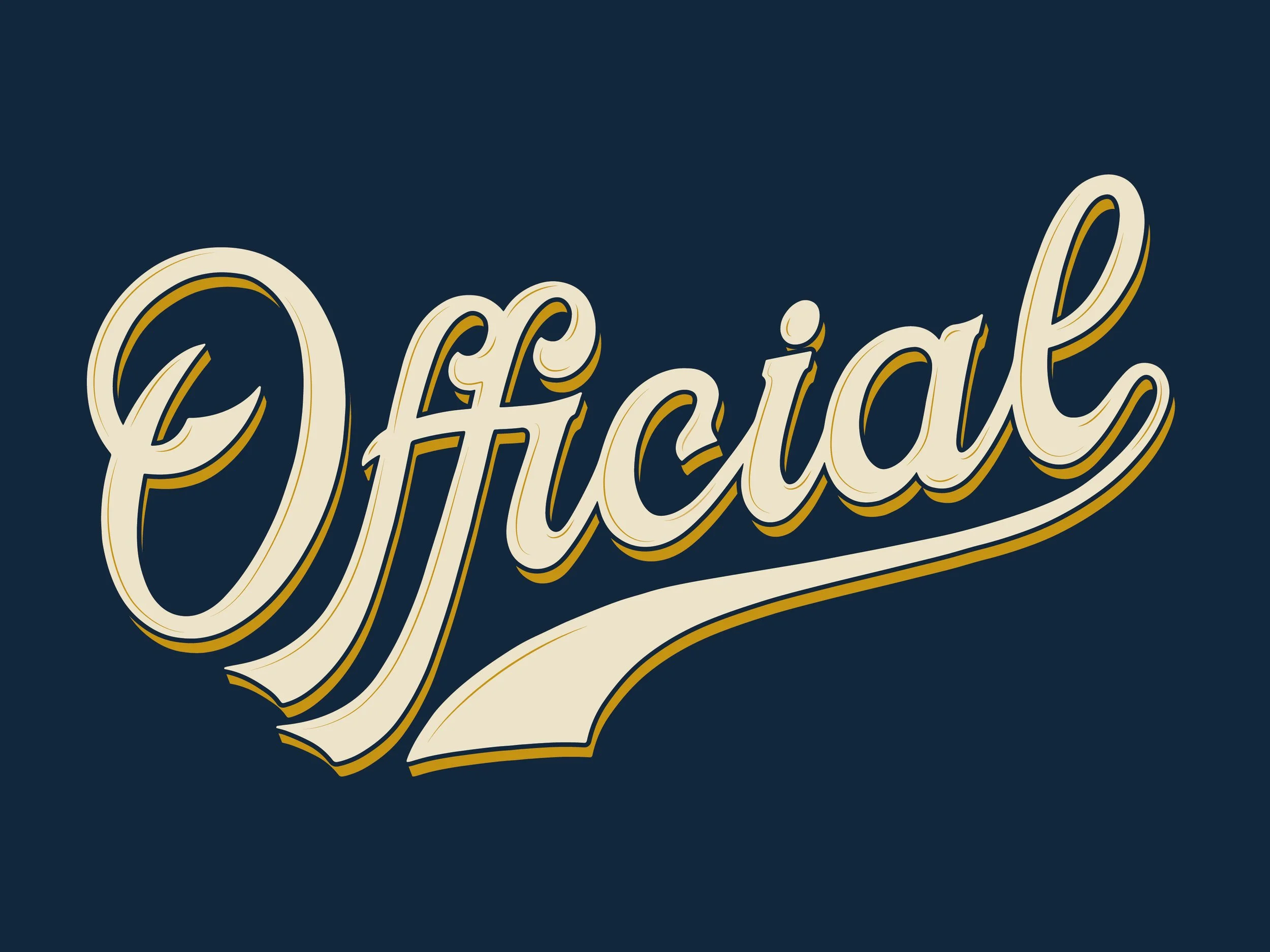
My hand-lettered “Official” boldly spans across the front of the label. The script was inspired by classic baseball lettering as well as the scripts on vintage beer cans. The gold can with the deep blue and cream colors make the label feel dignified and timeless. If ever there was an official-looking beer can, this is it.
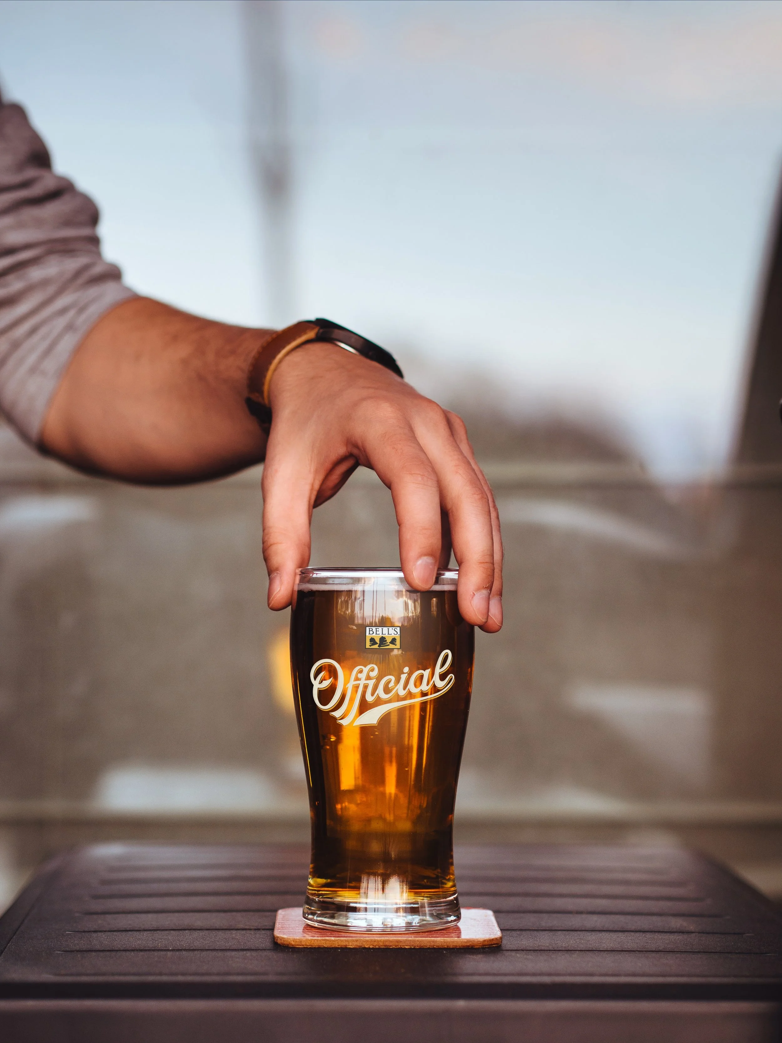
Bell’s Official reached national availability after only 9 months. It went on to become Bell’s #2 beer within 18 months of its launch, and was named the National Best Beer in 2019.
Fun side story: I was binge watching the 90 Day Fiance franchise one day when, during a scene at a bar in Louisiana, I saw a sign in the background that I recognized. It was a tin tacker for Bell’s Official, with my lettering large and in charge. I rewound and rewatched the scene at least 5 times afterwards. A very unexpected proud designer moment!

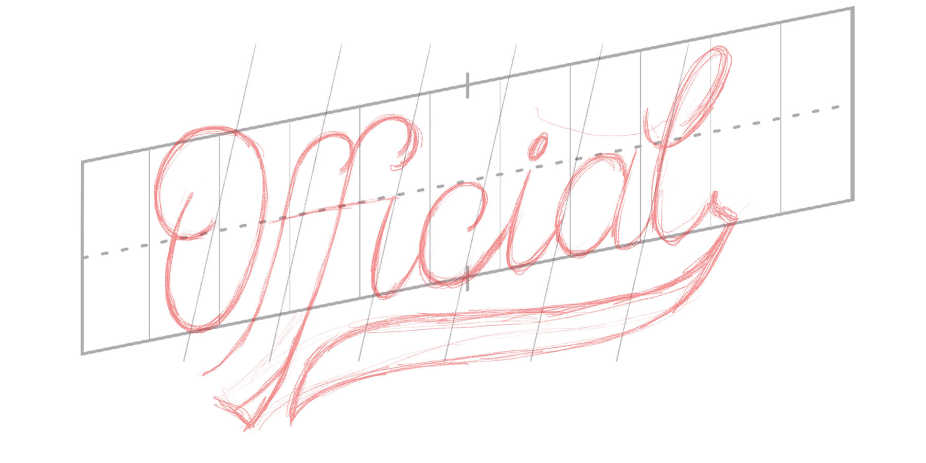
A quick glimpse at my lettering process for “Official”. Drawn on an iPad Pro using Procreate, then refined and vectorized by hand in Illustrator.
My favorite part of this piece of lettering is that “ffi” ligature — so tasty!
© 2025 Kirsten Schwenzer. 100% H.I. (human intelligence) powered design. 👩🏼💻