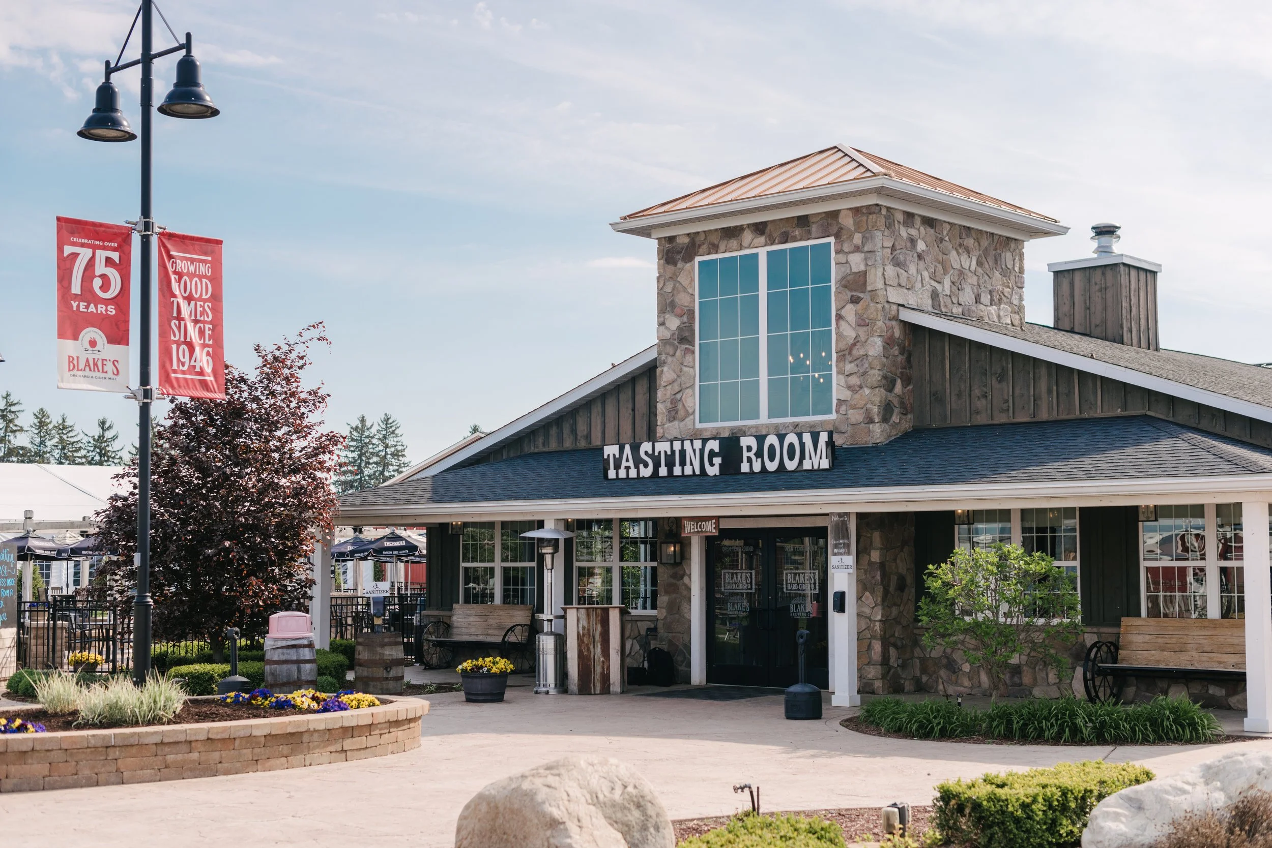
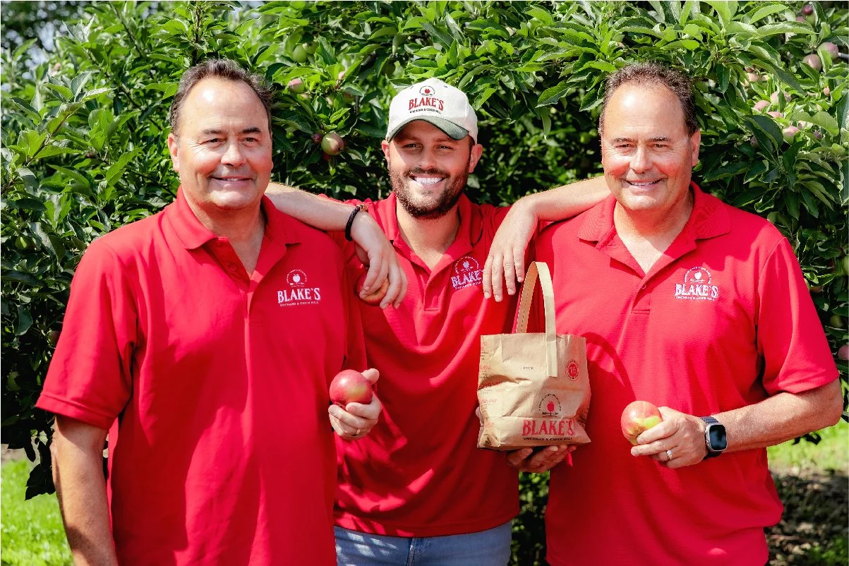
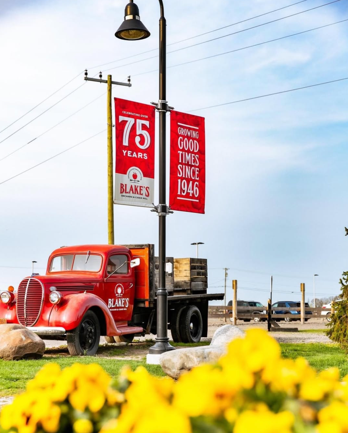
Blake Farms is home to an 800-acre working farm and orchard with a cider mill, funland, tasting room, and hard cider production facility. For seven decades Blake’s has strived to put community and environment at its forefront, with a passion for providing its visitors with the freshest homegrown fruit and vegetables and a memorable family experience. In 2021, to celebrate their 75th anniversary, Blake’s wanted to breathe new life into their branding and CPG line.
YEAR
2020-21
CLIENT
Blake Farms
INDUSTRY
Agriculture
ROLE
Branding
Packaging
Graphic Design
Marketing
Art Direction
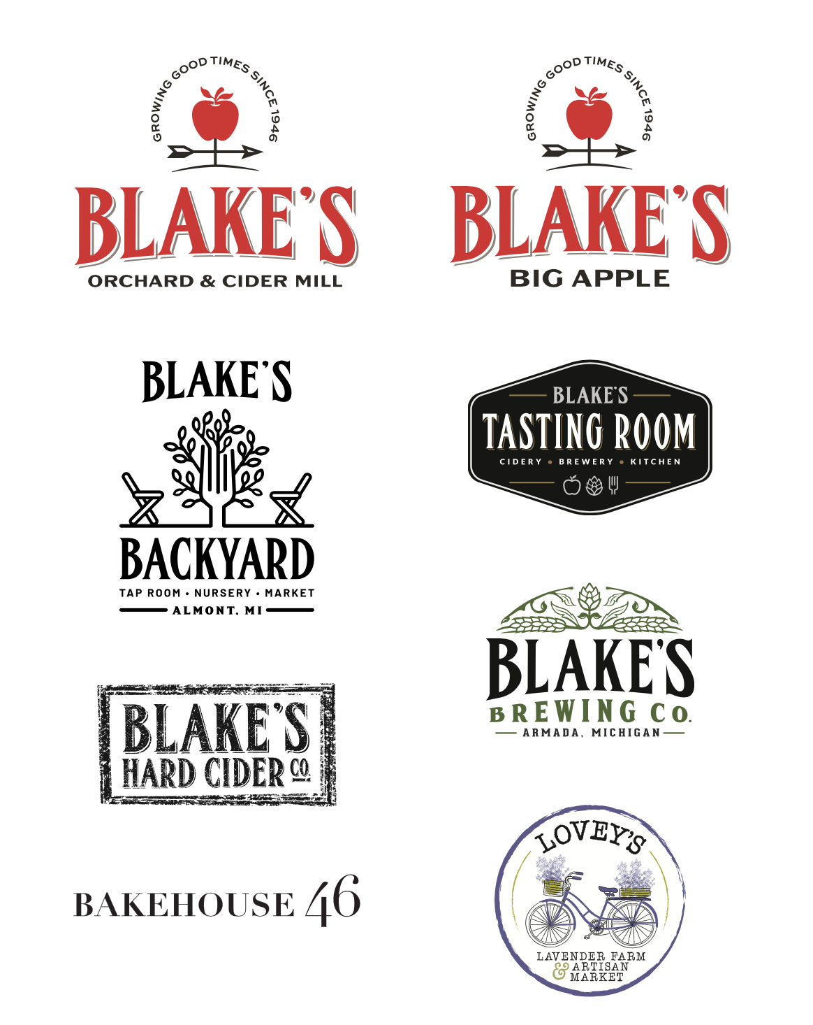
The Blake’s Family of Companies consists of multiple arms:
→ Blake’s Orchard & Cider Mill, their primary location and home to the farms, orchards, cider mill, funland, multiple restaurants, a boutique store, and hard cider production facility
→ Blake’s Big Apple, their second cider mill location which also hosts yearly haunted attractions
→ Blake’s Backyard, a store, restaurant, taproom, and garden center
→ Blake’s Farm Style Foods, a food line consisting of freshly made cider mill fare as well as wholesale foods
→ Blake’s Hard Cider, a national hard cider brand
The largest challenge we faced when refreshing the Blake’s branding was ensuring that the new logo fit alongside the existing Blake company logos. We paid special attention to the Blake’s Hard Cider logo because this is the most well-known Blake’s business, and it was important for the new Orchard & Cider Mill logo to visually communicate that the two businesses are related.
We also wanted to bring in more of a heritage, “farm”-like feel to the overarching visual identity to honor the rich history of Blake’s. Generations of Blakes put in hard work to build the farm that generations of Detroiters have enjoyed. The resulting brand refresh does just that, while still elevating the brand to communicate that they’re metro Detroit’s premiere year-round destination for family fun.
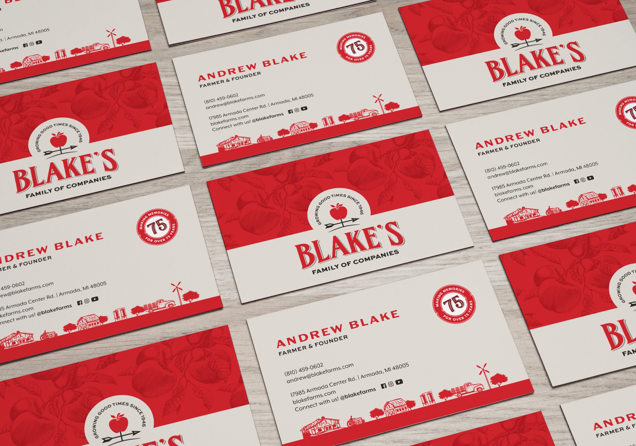
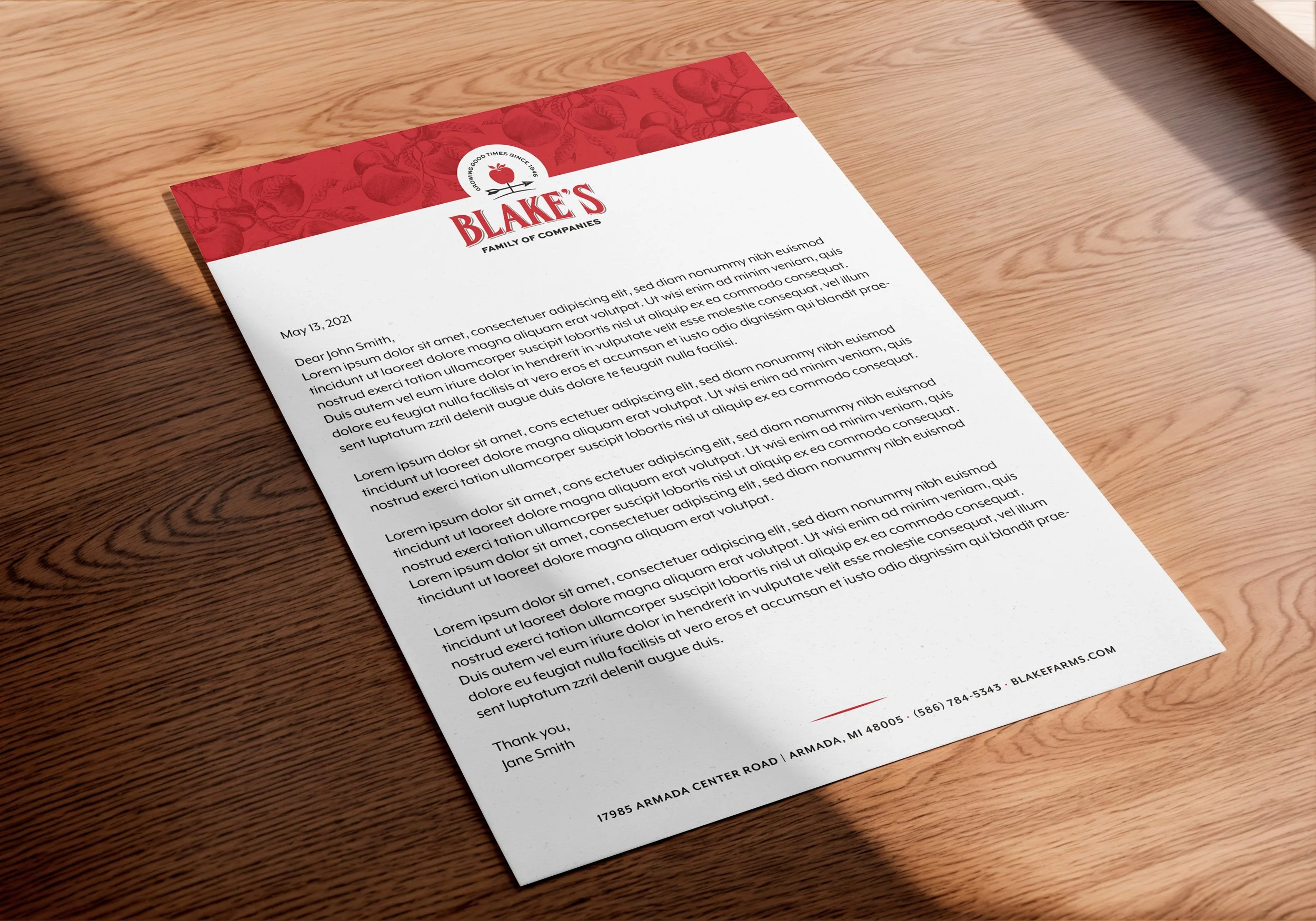
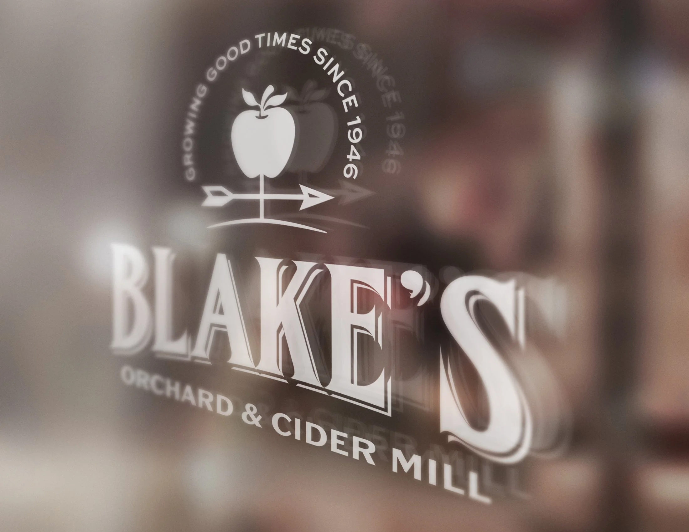
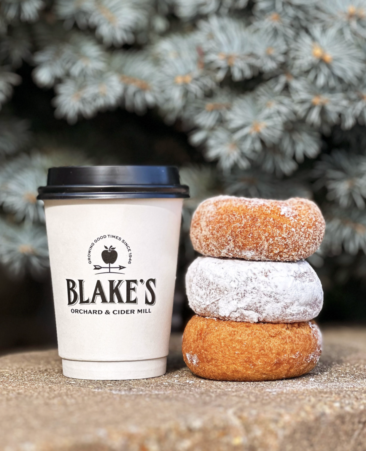
The primary visual link between the new Blake’s logo and the other Blake company logos is the brand font, FHA Condensed French. The consistent usage of this font throughout all logos communicates to the customer that these businesses are part of the same “family tree.” The new Family of Companies, Orchard & Cider Mill, and Big Apple logos also include the same dropshadow from the Blake’s Hard Cider logo to further strengthen that visual link. Finally, the bottom arch on the “Blake’s” logotype is pulled from the Blake’s Brewing logo.
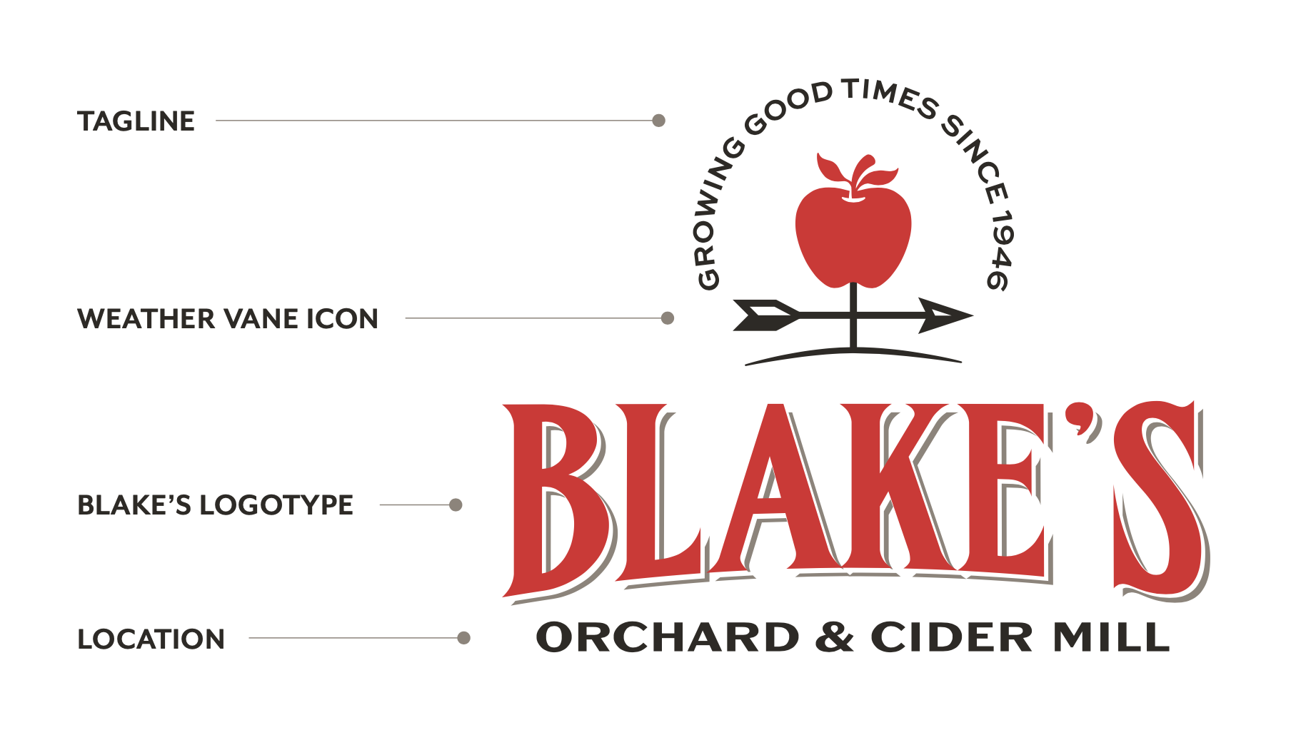
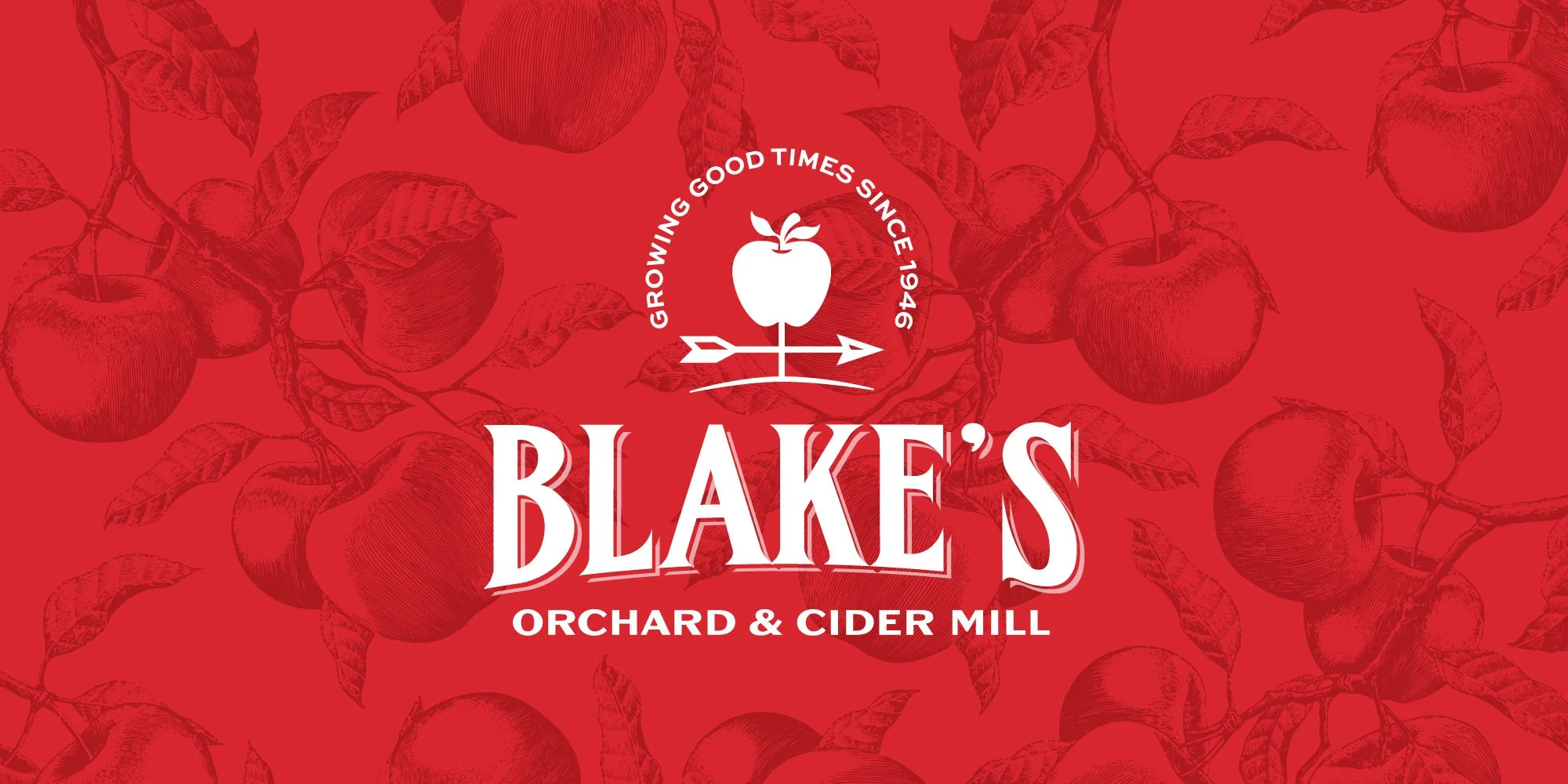
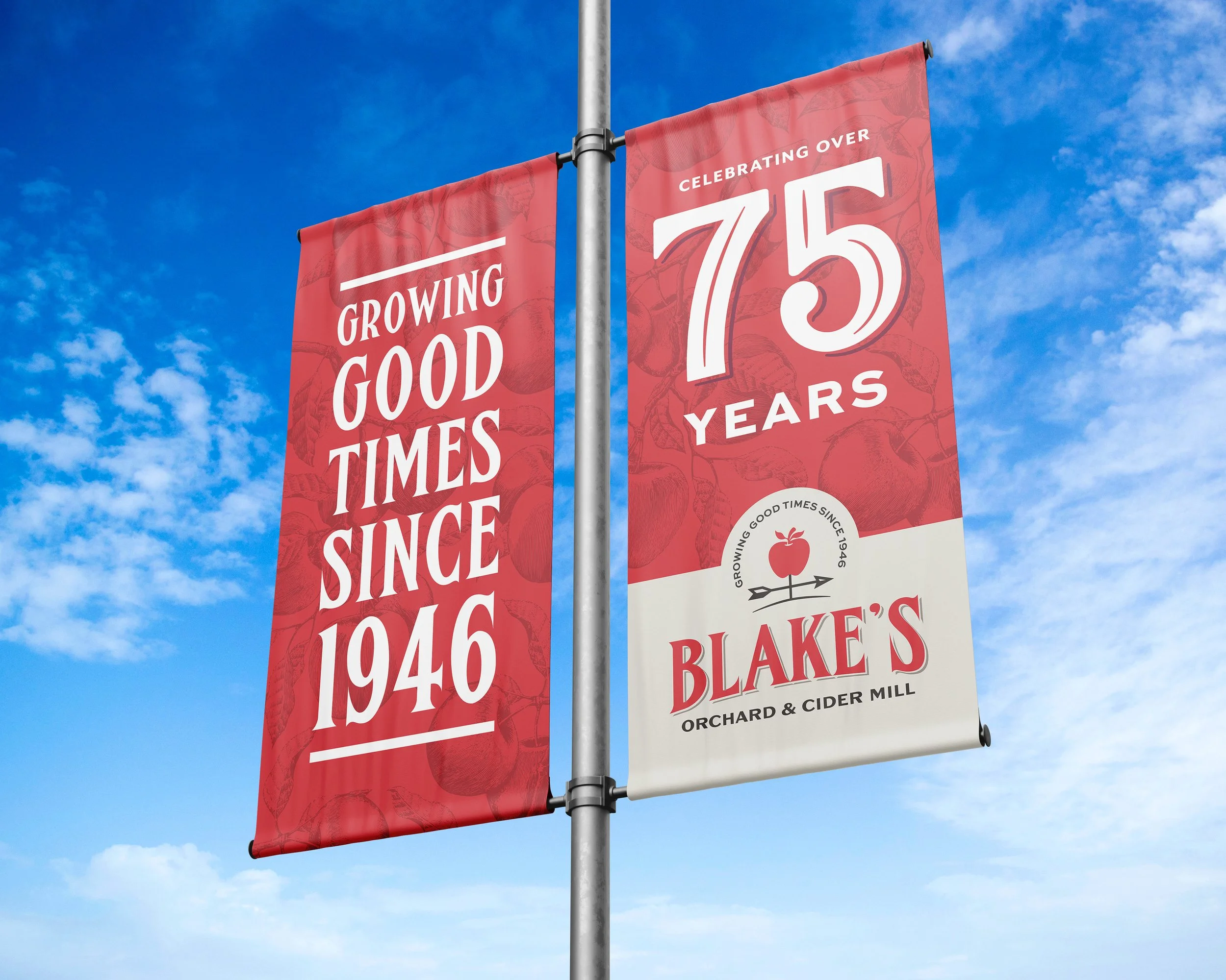
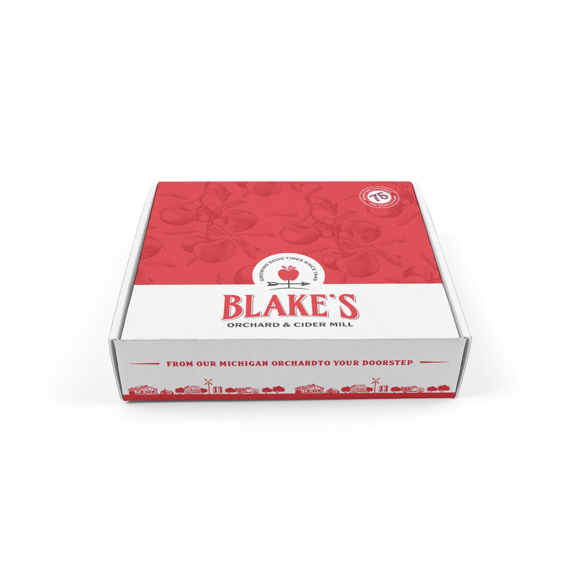
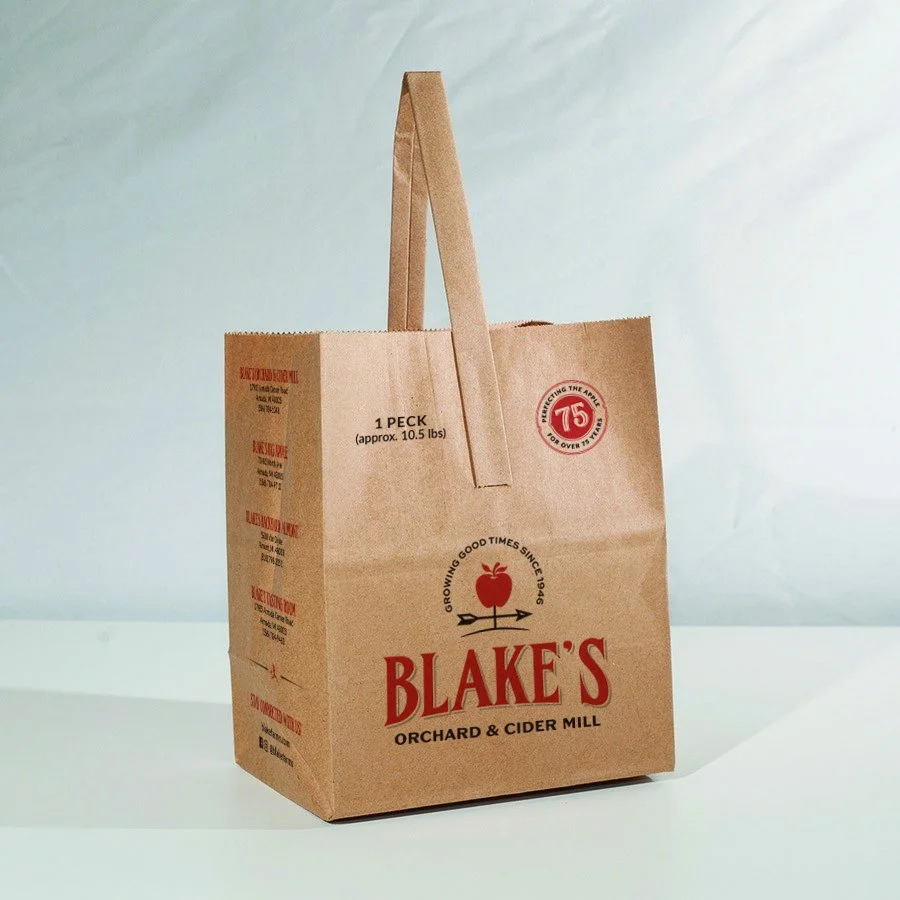
The official tagline of Blake’s is “Growing good times since 1946”. It is consistent on the logos for Blake’s Family of Companies, Blake’s Orchard & Cider Mill, and Blake’s Big Apple. However, the tagline changes on the logos for Blake’s Provisions, Blake’s Cider Mill Fare, and Blake’s Cold Pressed Juices to better describe their respective product lines.
The weather vane icon represents Blake’s farm heritage and symbolizes their apple growing roots (no pun intended). The apple in the weather vane also allows for flexibility in the branding and can change for the product lines or events.
The apple pattern adds a pop of color and texture. It utilizes an engraving-style illustration to emphasize Blake’s generations of farming heritage.

The weather vane icon is a flexible element; it can change from an apple to a sunflower for the annual Sunflower Festival, flowers for the u-pick flower fields, or a zombie for Blake’s Haunted Apple.
© 2025 Kirsten Schwenzer. 100% H.I. (human intelligence) powered design. 👩🏼💻