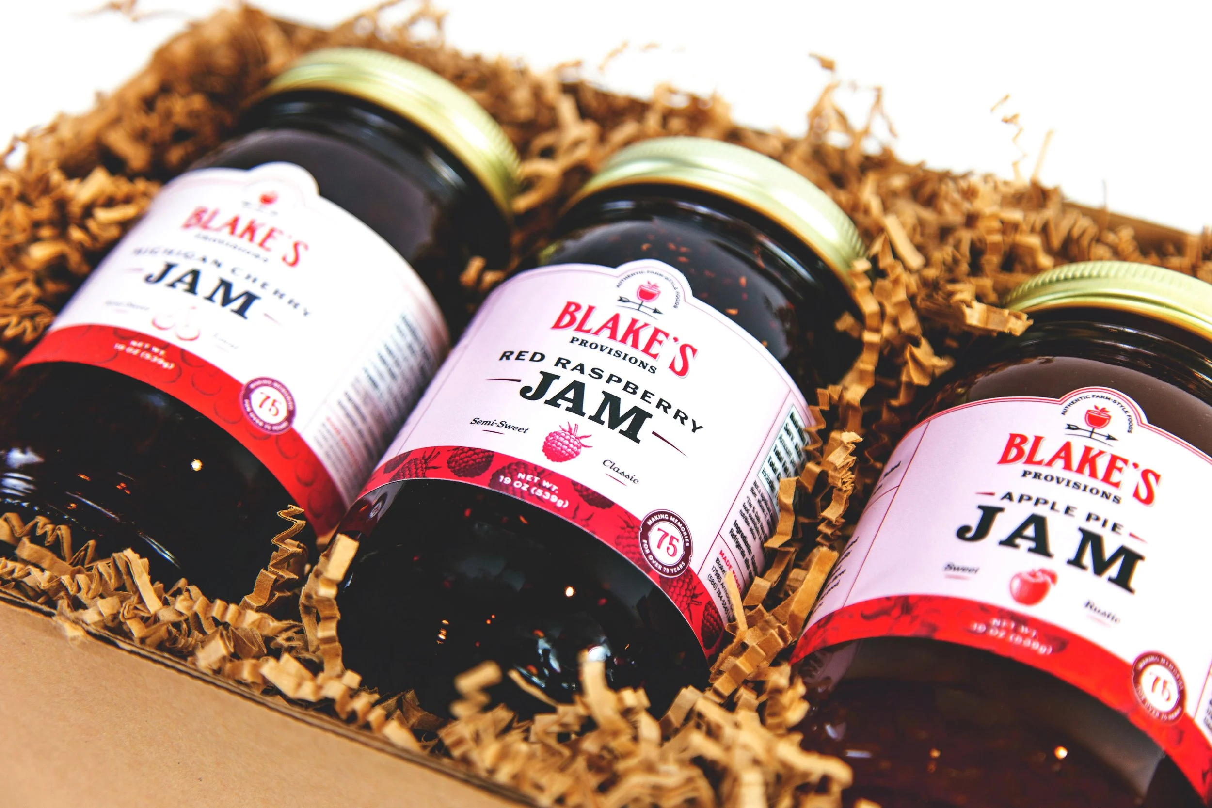
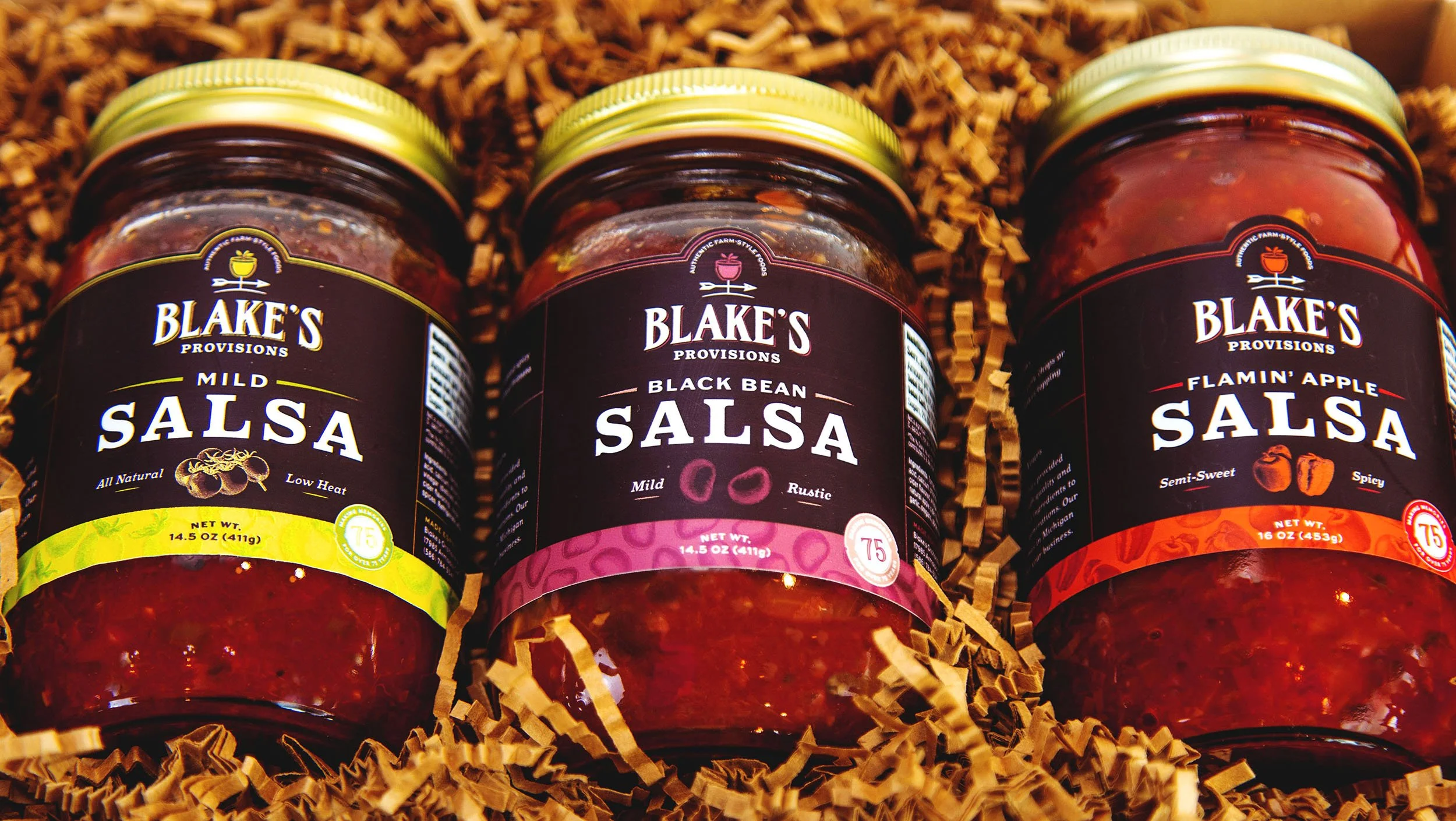
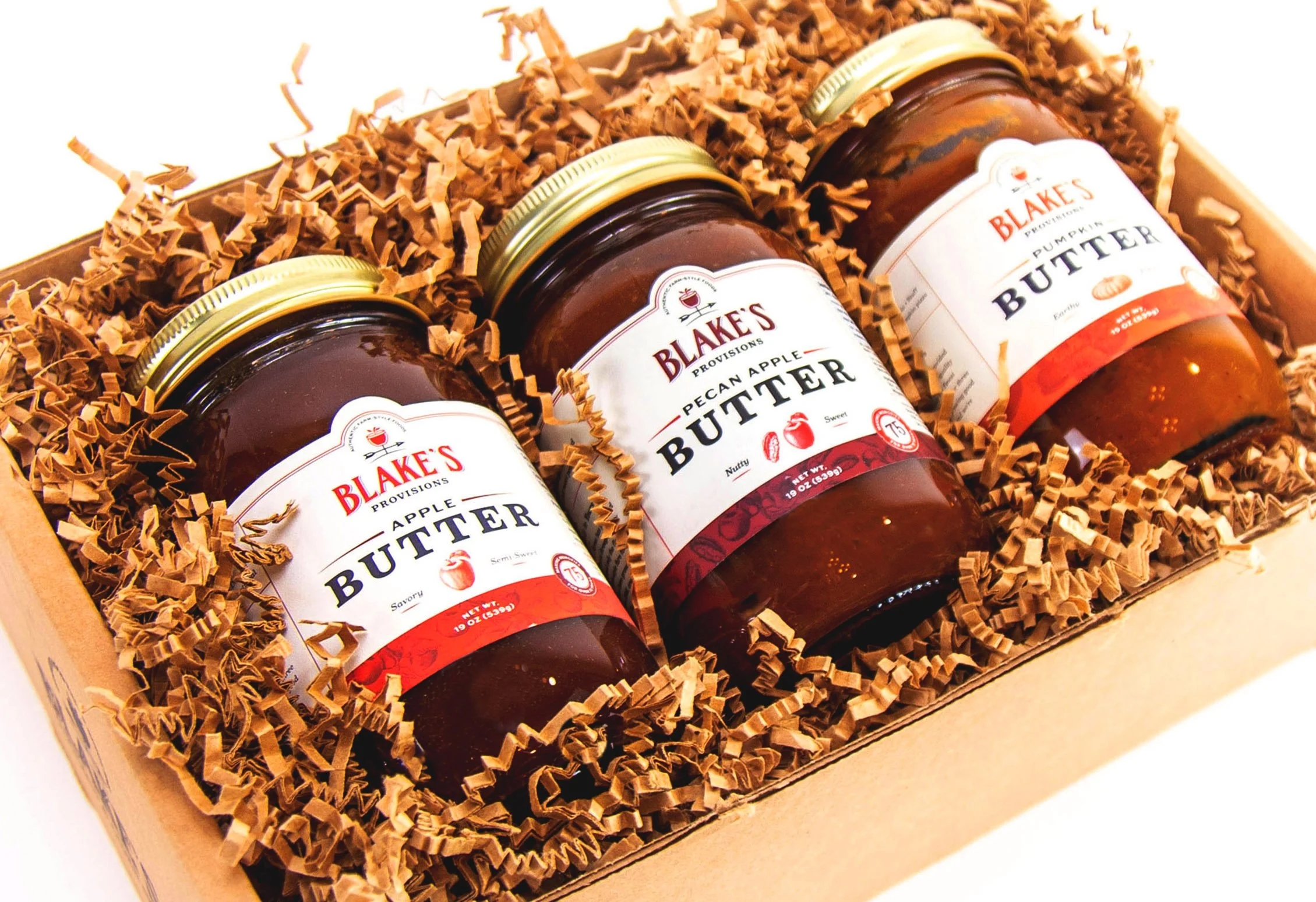
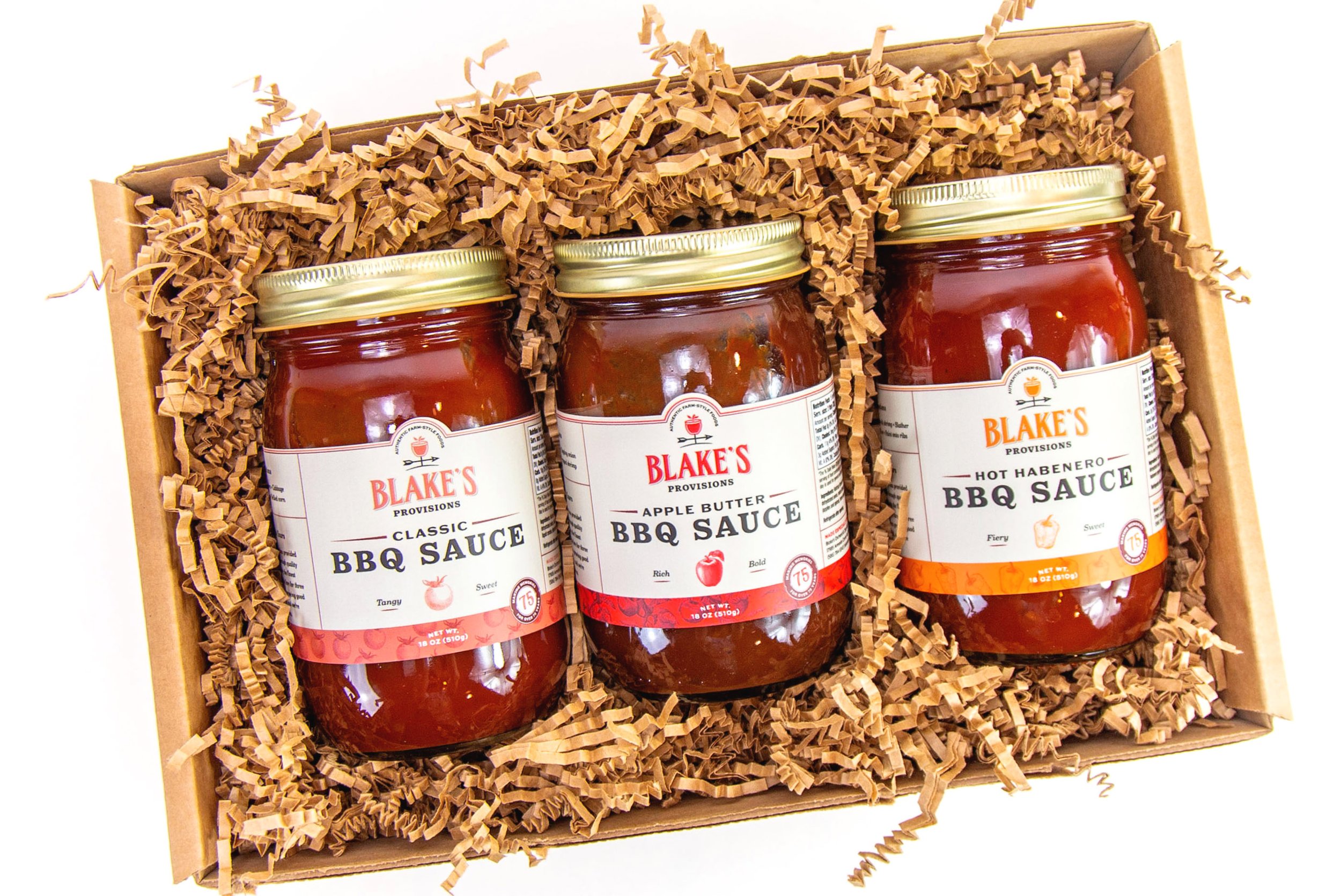
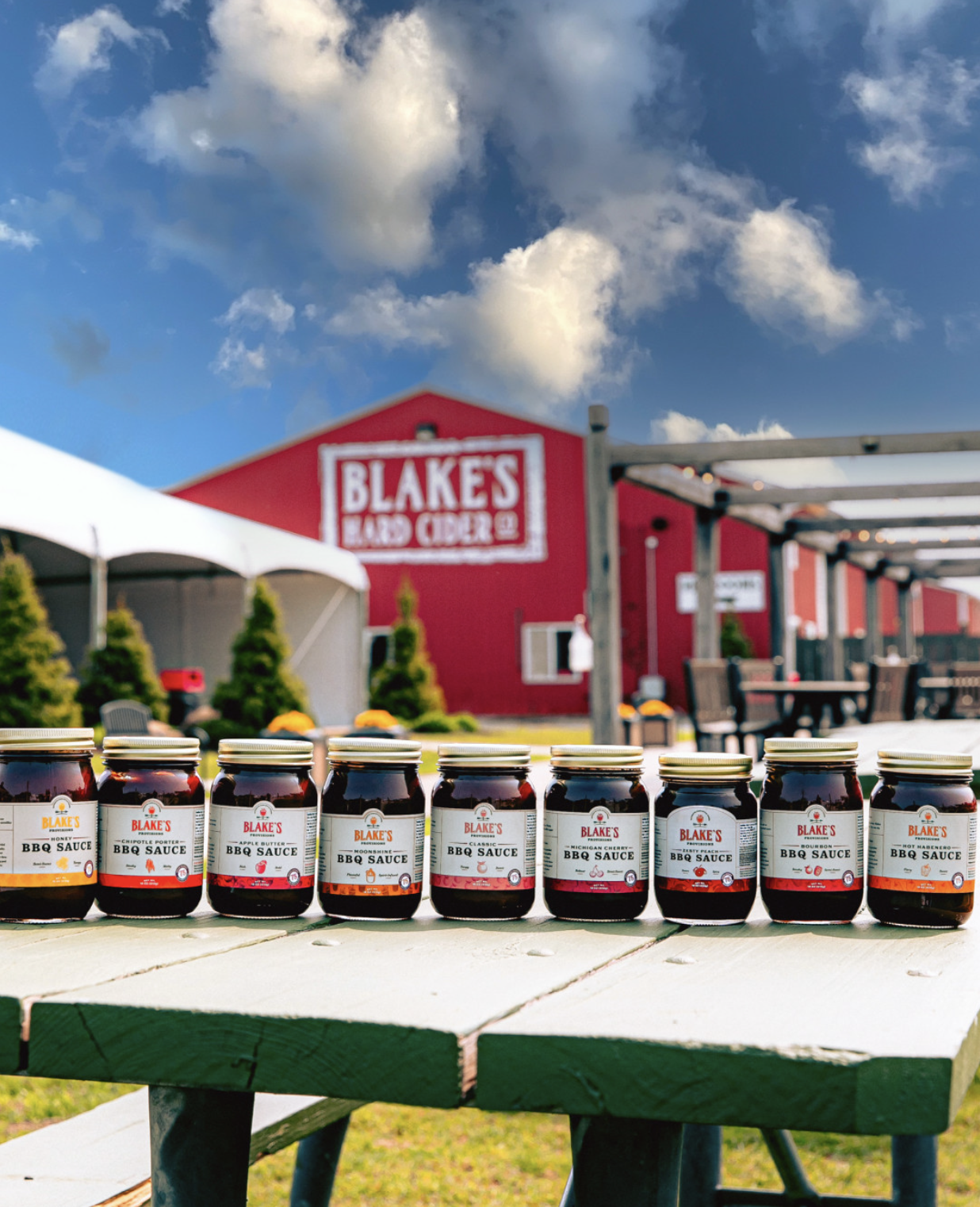
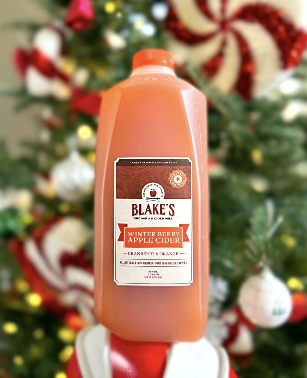
As part of their brand refresh in 2021 commemorating their 75th anniversary, Blake’s line of CPG products underwent a facelift. Their offerings include canned fruits and veggies, dressings, sauces, jams and jellies, condiments, and standard cider mill fare like donuts and cider.
YEAR
2020-21
CLIENT
Blake Farms
INDUSTRY
Agriculture
ROLE
Packaging
Print Production
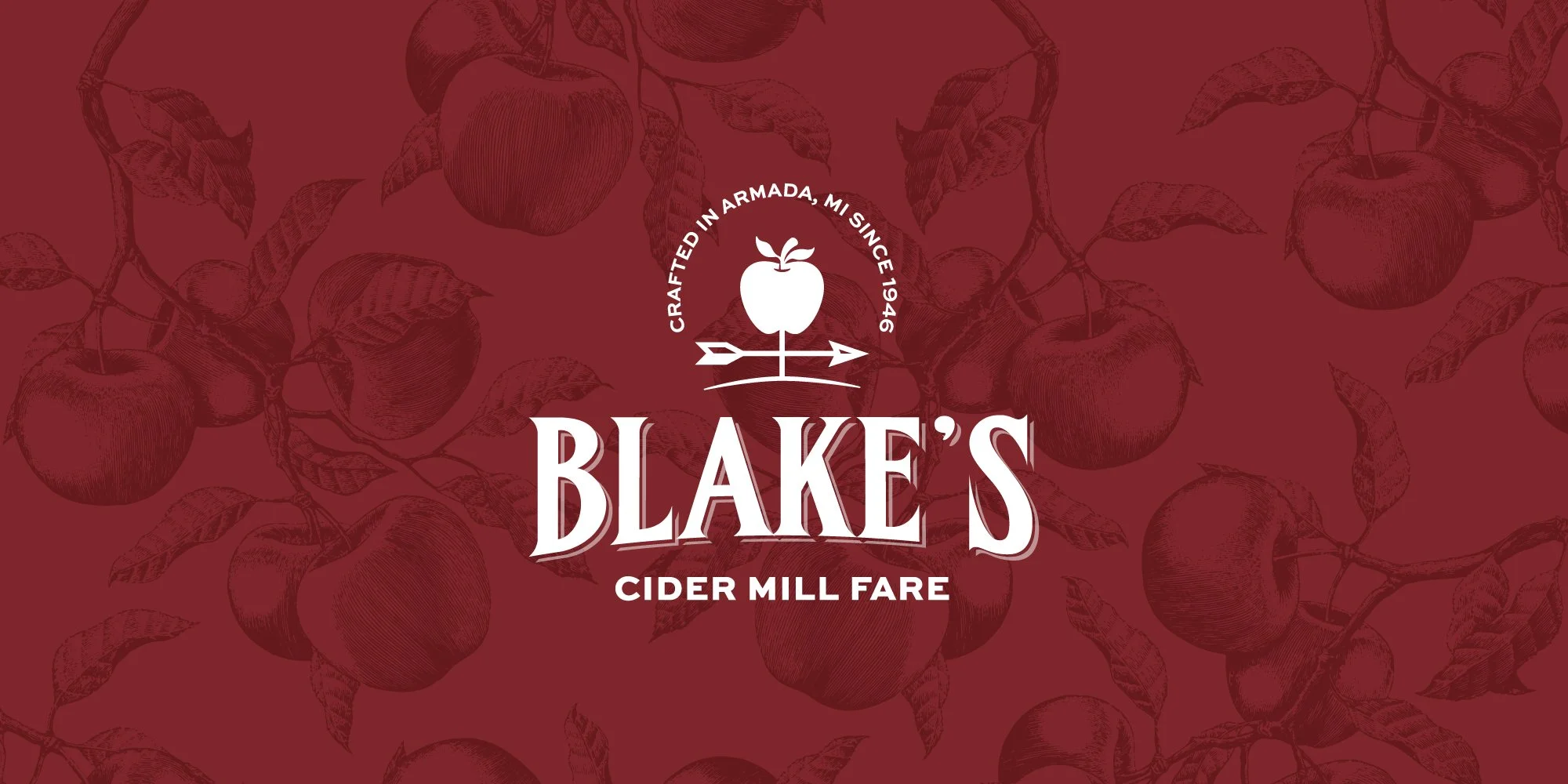
The biggest challenge—aside from designing a scalable system that can work on a variety of label sizes and types—was figuring out how to delineate their homemade cider mill foods from their canned goods. We decided to keep the lines separate for organization and clarity purposes. The new name for the canned goods became “Blake’s Provisions,” and the homemade products “Blake’s Cider Mill Fare,” names that more accurately describe the variety of foods in each line. Each has its own logo and visual language that follow the system we designed for the umbrella company, Blake Farms, to ensure brand consistency and recognition when the products are sold wholesale.
The resulting design system is scalable and cohesive, and the easy-to-follow template increased production efficiency for buildout.
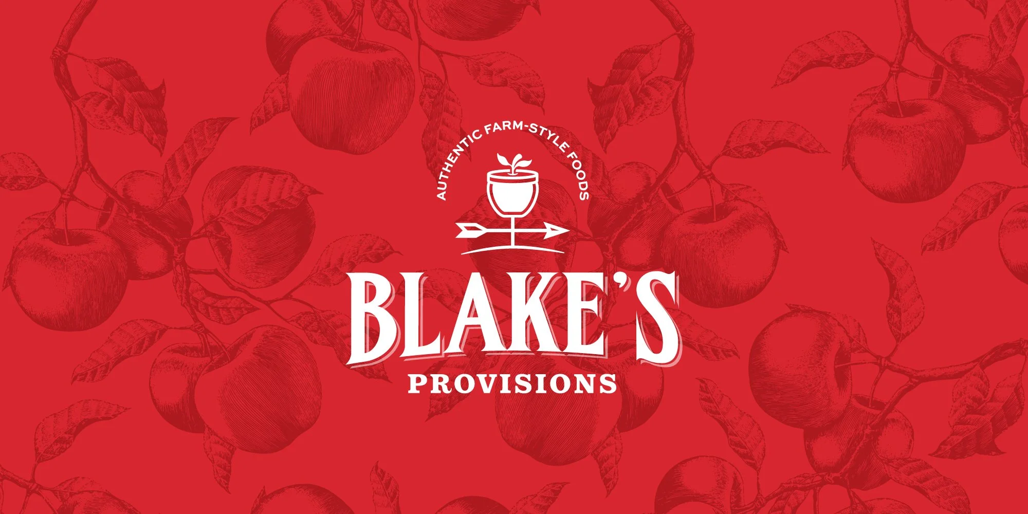
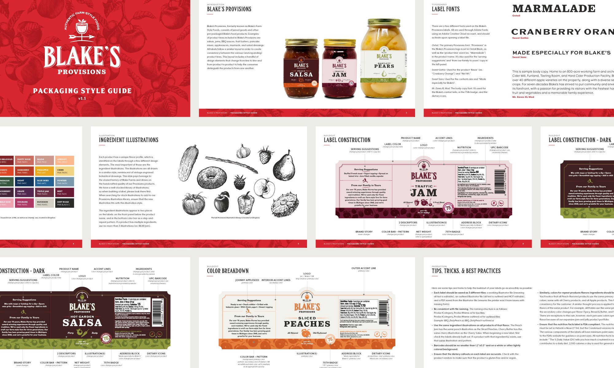
The weathervane in the Provisions logo is slightly different to help distinguish the products from Blake’s Cider Mill Fare goods. All labels follow a similar layout in order to create consistency between the various (and expanding) product lines. This layout includes a handful of design elements that change from line to line and from product to product to help the consumer distinguish the products from one another. Color palettes are assigned to product categories and specific flavors; illustrations, following the engraving-style of the primary Blake’s apple pattern, are also product specific.
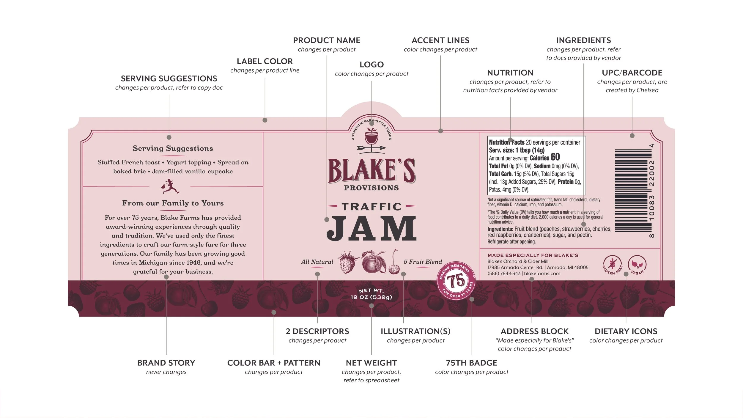
Construction breakdown of a Provisions label to help efficiency when passed off to a production designer.
© 2025 Kirsten Schwenzer. 100% H.I. (human intelligence) powered design. 👩🏼💻