
Stroh’s Brewery has a history dating back to 1850, when a German immigrant named Bernhard Stroh came to Detroit and started brewing his take on an old family recipe. He carted his brews around in a wheelbarrow, selling them door-to-door to the workers building up this great American city.
YEAR
2018
STUDIO
Driven Creative Supply Co.
INDUSTRY
Liquor
ROLE
Packaging
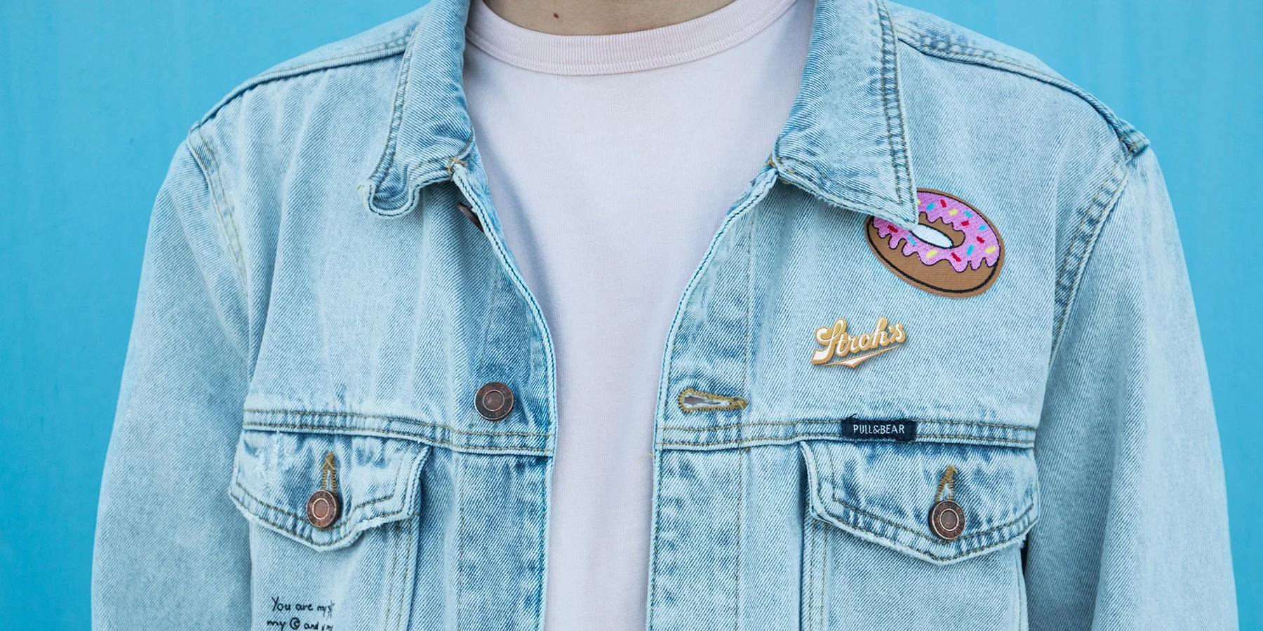
Driven was invited to pitch packaging redesign options to Stroh’s in 2018. The goal was to create a system that would work for all their beers, with a modern look that still honored their history. I wanted to use their classic, recognizable script logotype as the cornerstone of my label design, along with colors pulled from their previous packaging. The result? Two options that feel clean, modern, and distinct from other beers in the category while still honoring Stroh’s heritage.
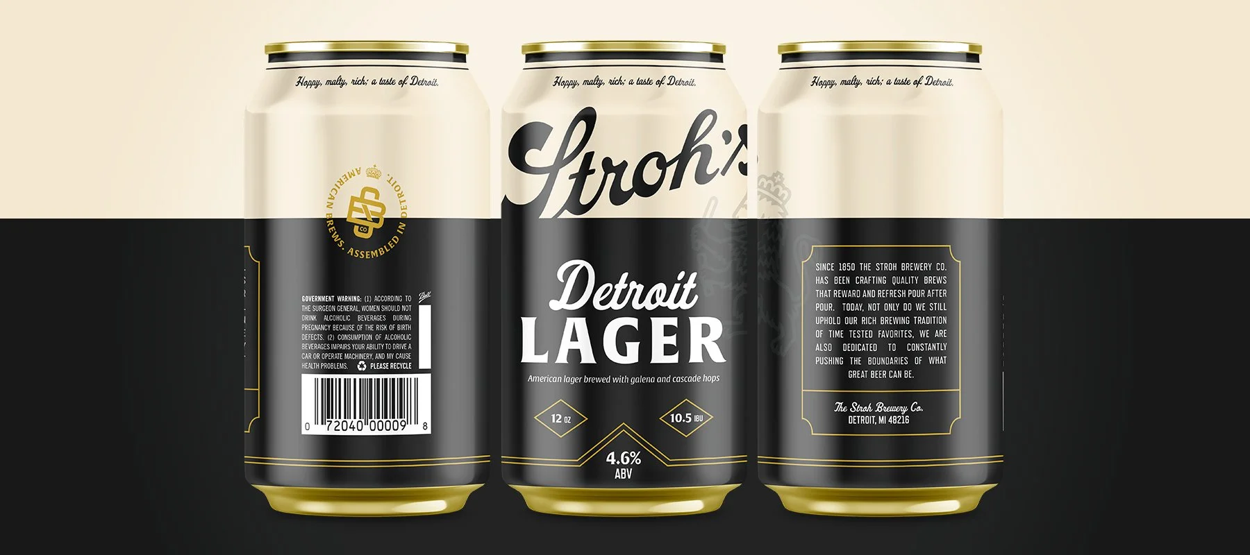
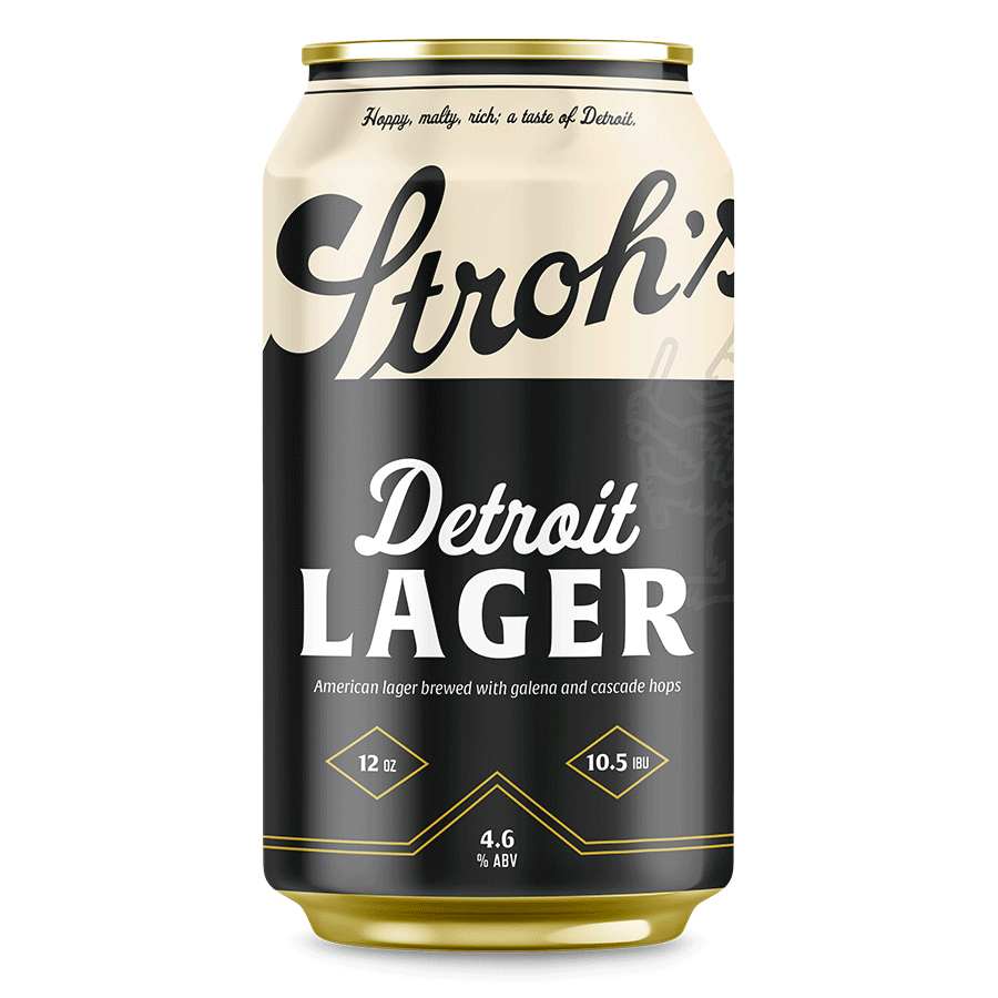
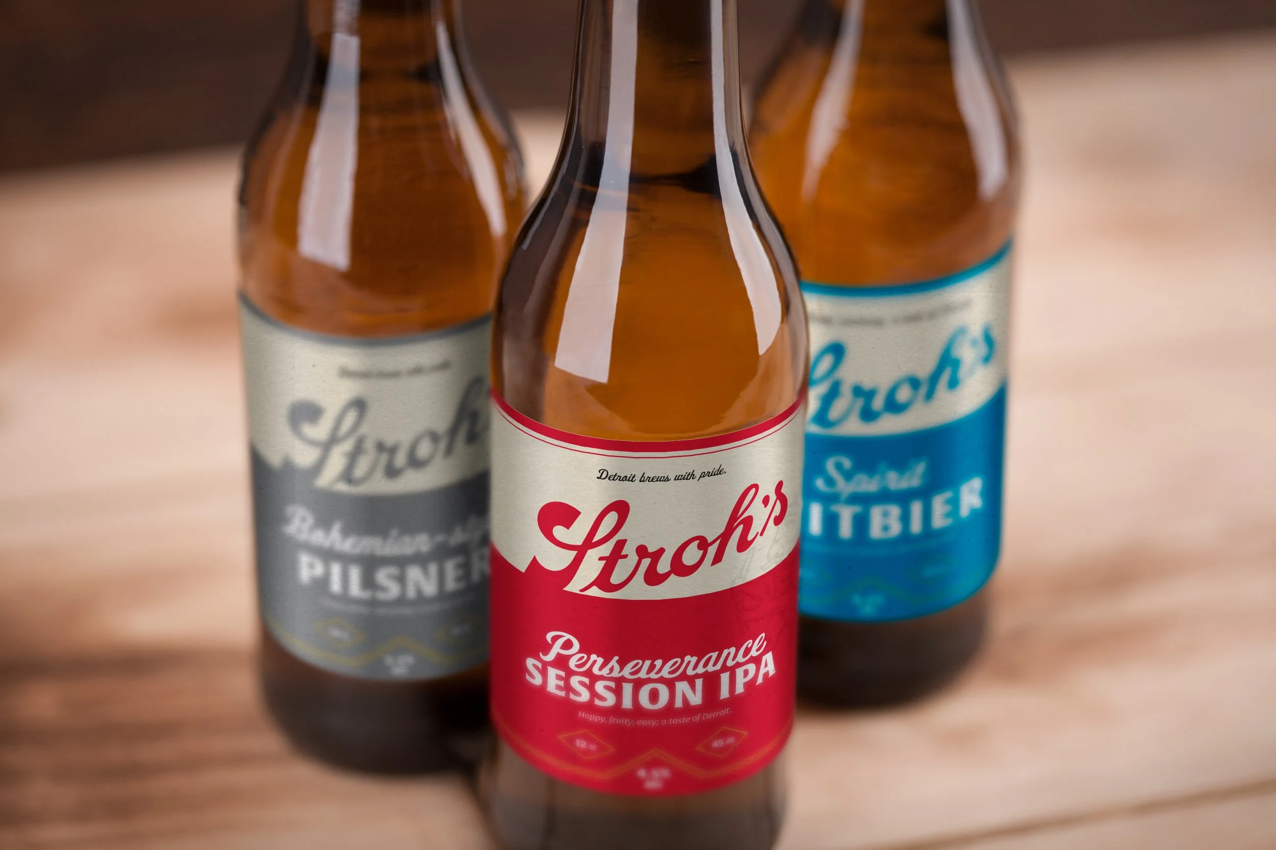
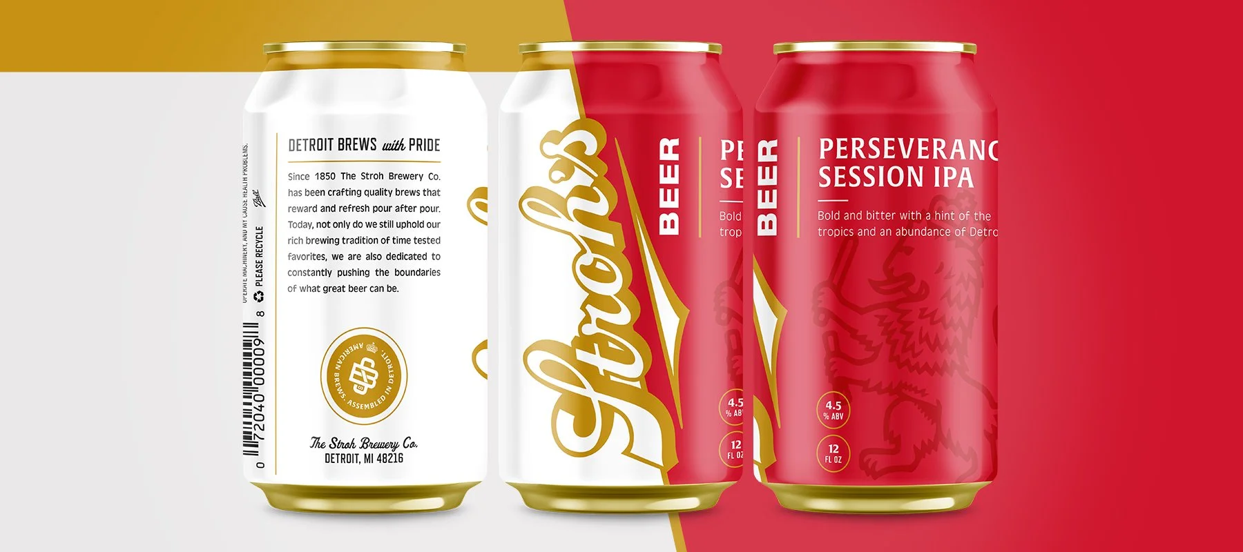
Direction 1 features the logotype bleeding into a field of color specific to the style of beer. The layout and additional design elements, like the holding shapes around some of the text, are a bit more traditional and elegant; these choices help to elevate the label, which would differentiate Stroh’s from similar beers like Miller Lite, PBR, and Hamm’s.
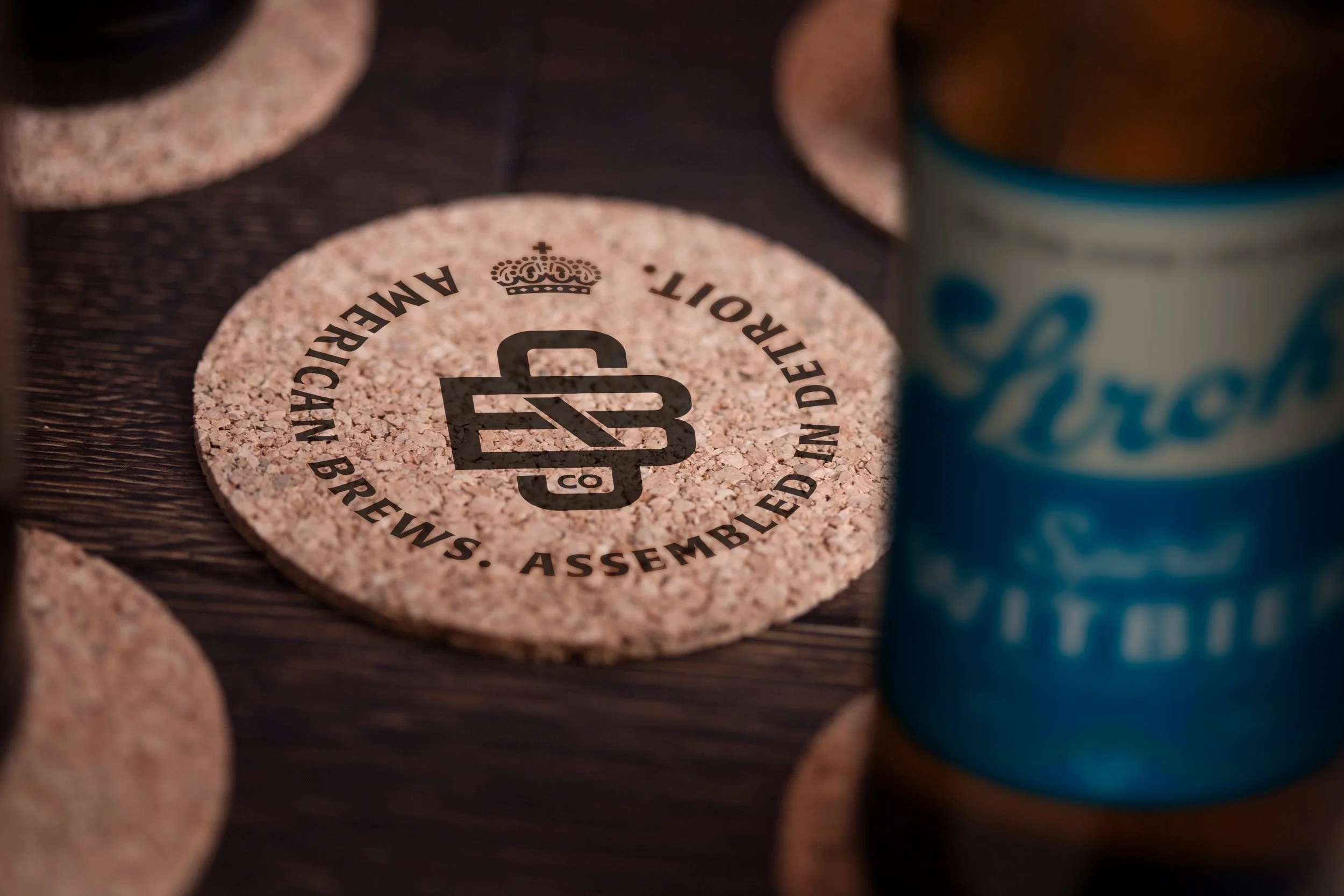
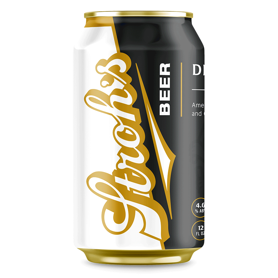

Direction 2 uses the classic Stroh’s script logotype large and in charge vertically on the label, with a bold gold outline and solid drop shadow. The Stroh’s lion also features prominently—an icon that dates back to the beginning of Stroh’s, when Bernhard Stroh adopted the symbol as a nod to his hometown of Kirn in Germany. This direction feels a bit more contemporary than Direction 1, and it’s far different from Stroh’s competitors.
© 2025 Kirsten Schwenzer. 100% H.I. (human intelligence) powered design. 👩🏼💻