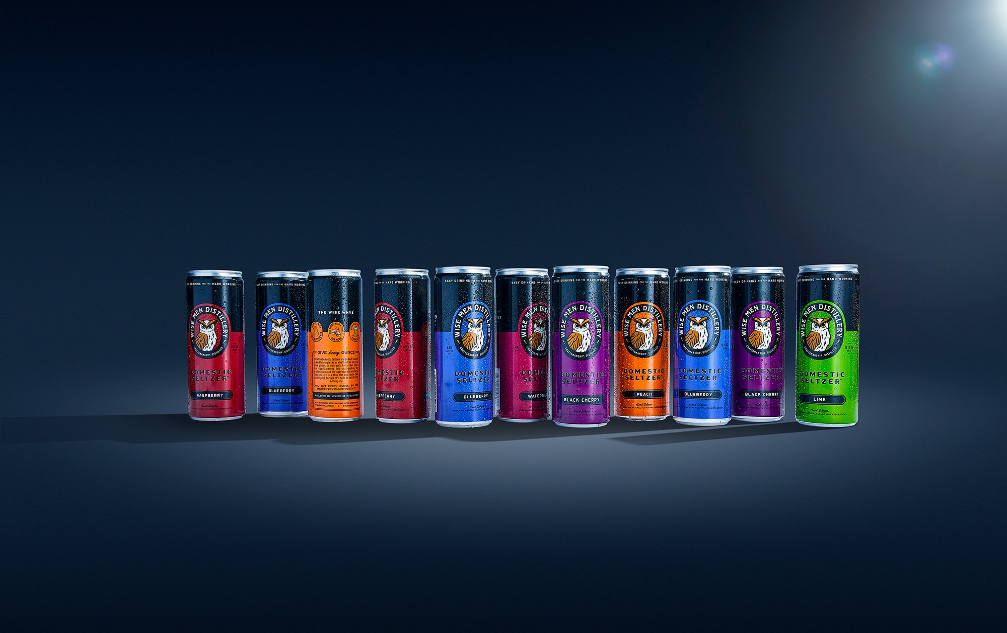
Wise Men Distillery produces award-winning hand-crafted spirits and hard seltzers and operates two tasting rooms in the Grand Rapids area.
YEAR
2024
STUDIO
Driven Creative Supply Co.
INDUSTRY
Liquor
Branding
Illustration
Packaging
Graphic Design
ROLE
Wise Men’s story began in 2019 with friends and moonshine—the first spirit they crafted. They soon expanded to vodka, gin, rum, whiskey, bourbon, and hard seltzer. Over the years, they racked up some awards too: a “Best in Class” for their vodka at the Craft Distillers Spirits Competition as well as “Michigan Rum Distillery of the Year”.
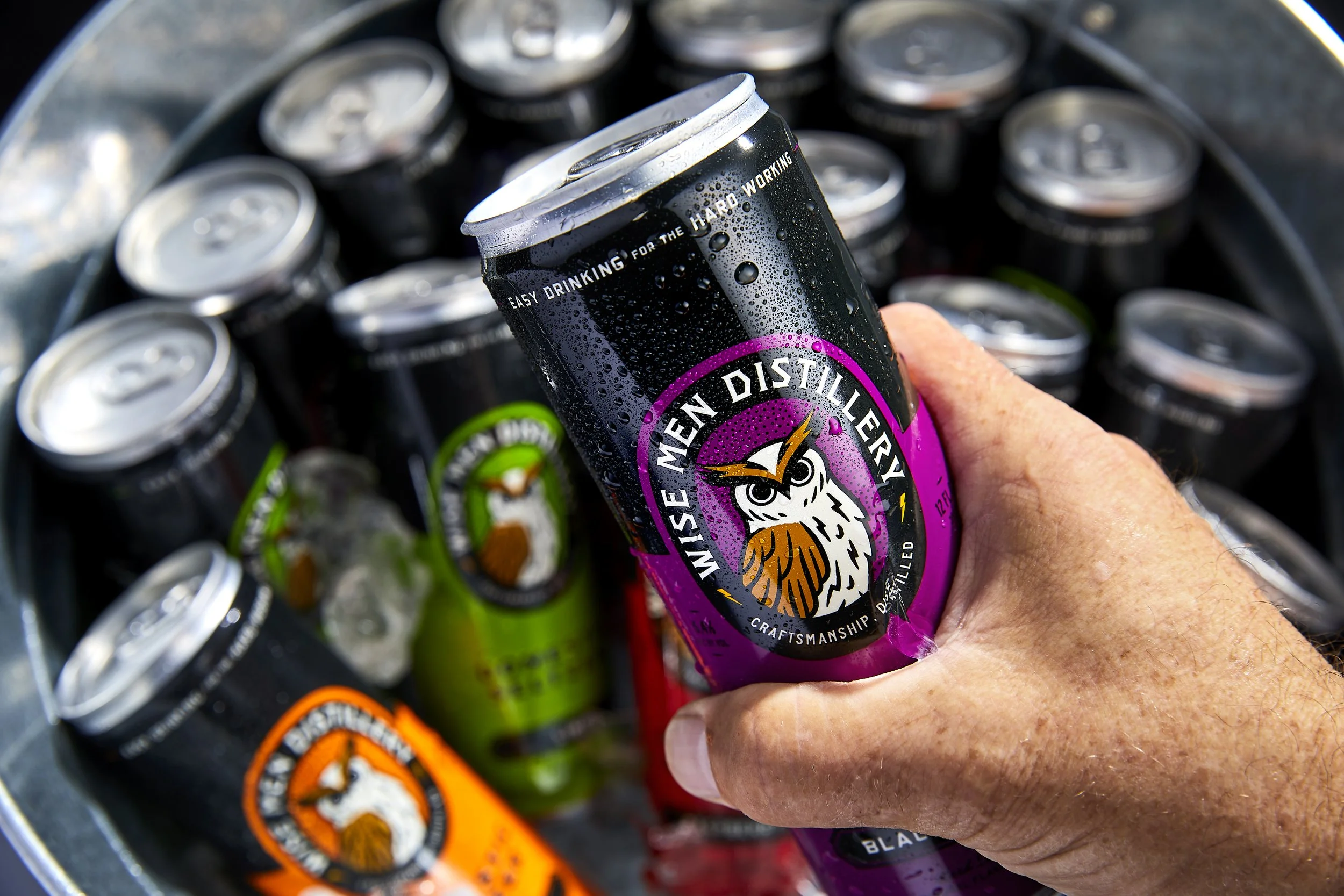
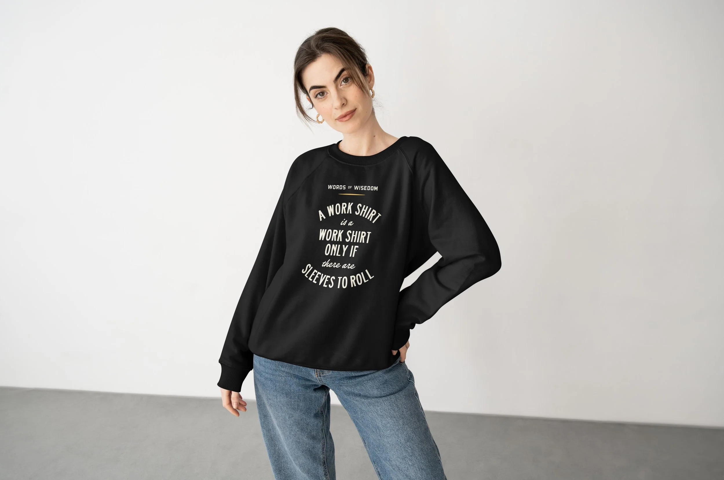
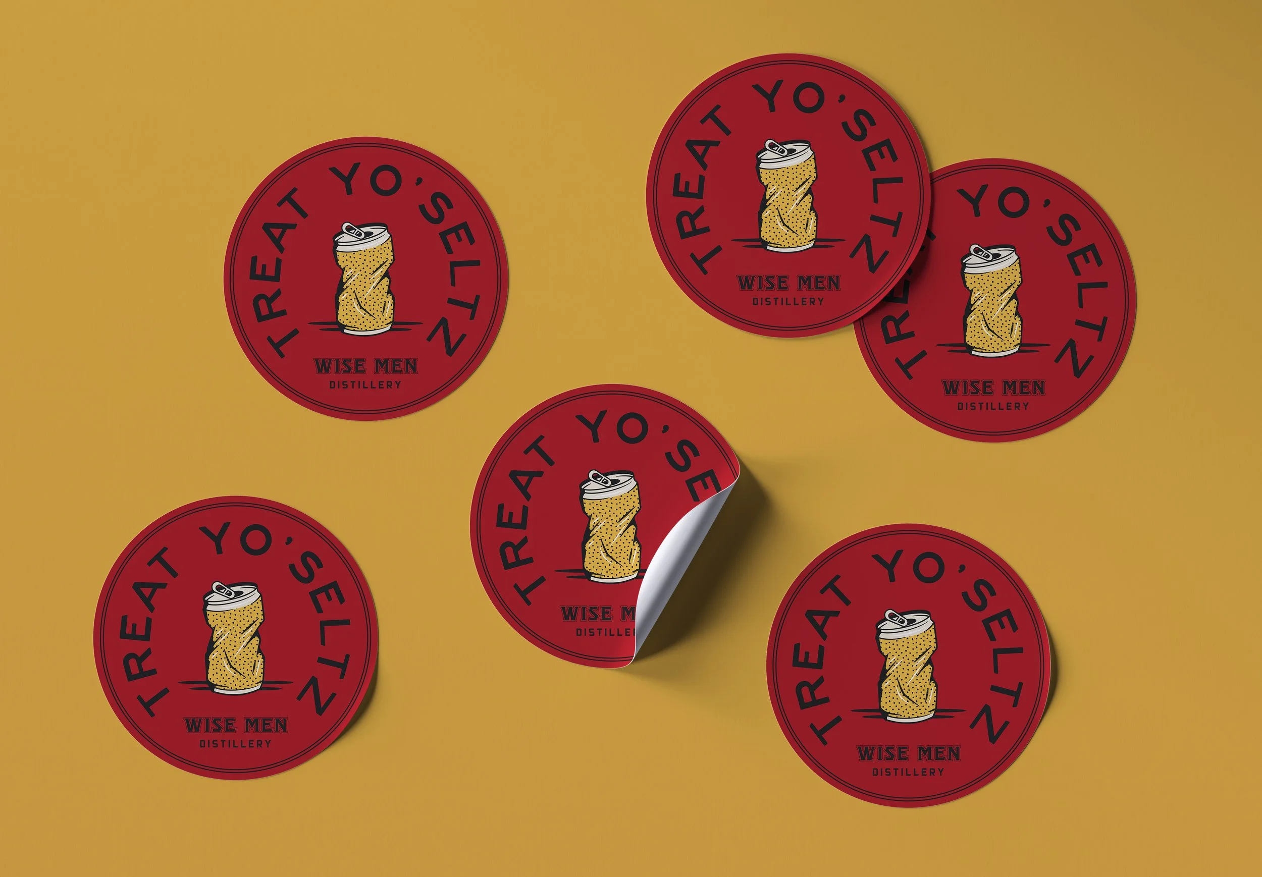
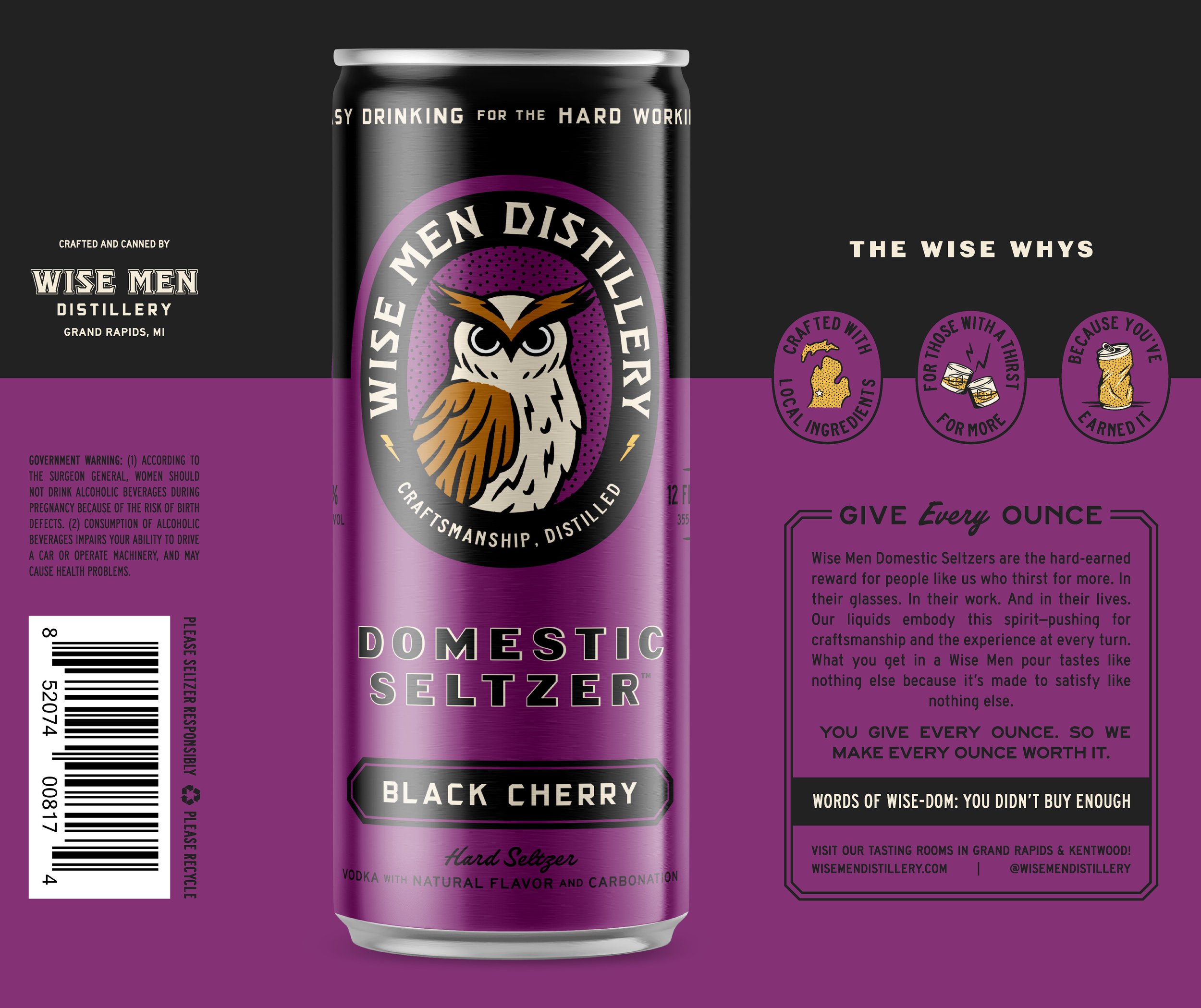
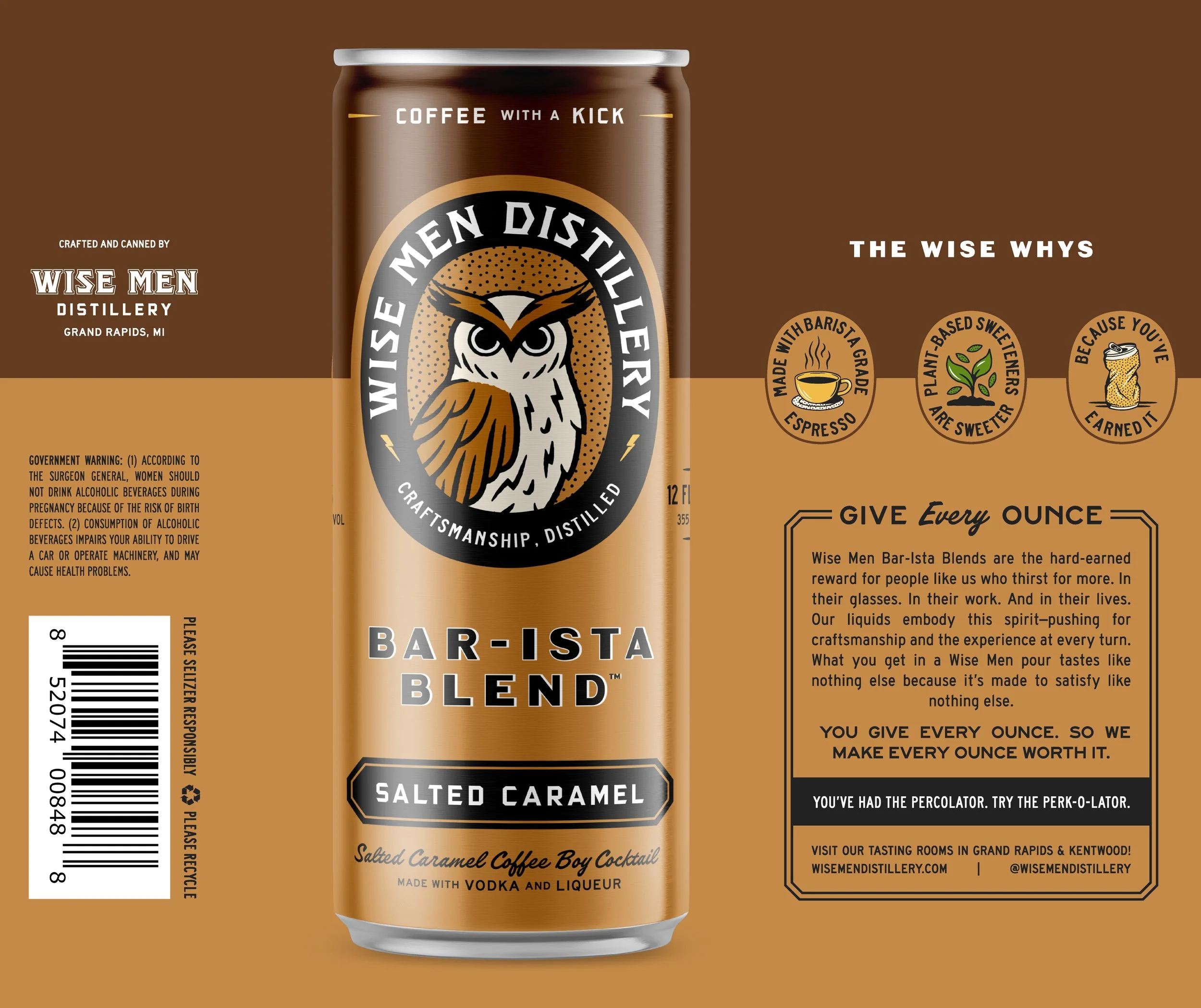
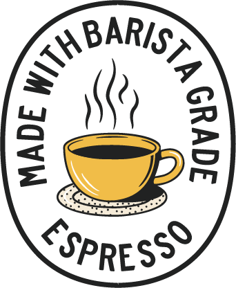
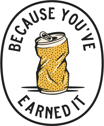
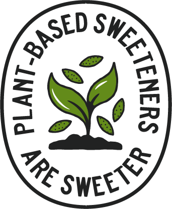
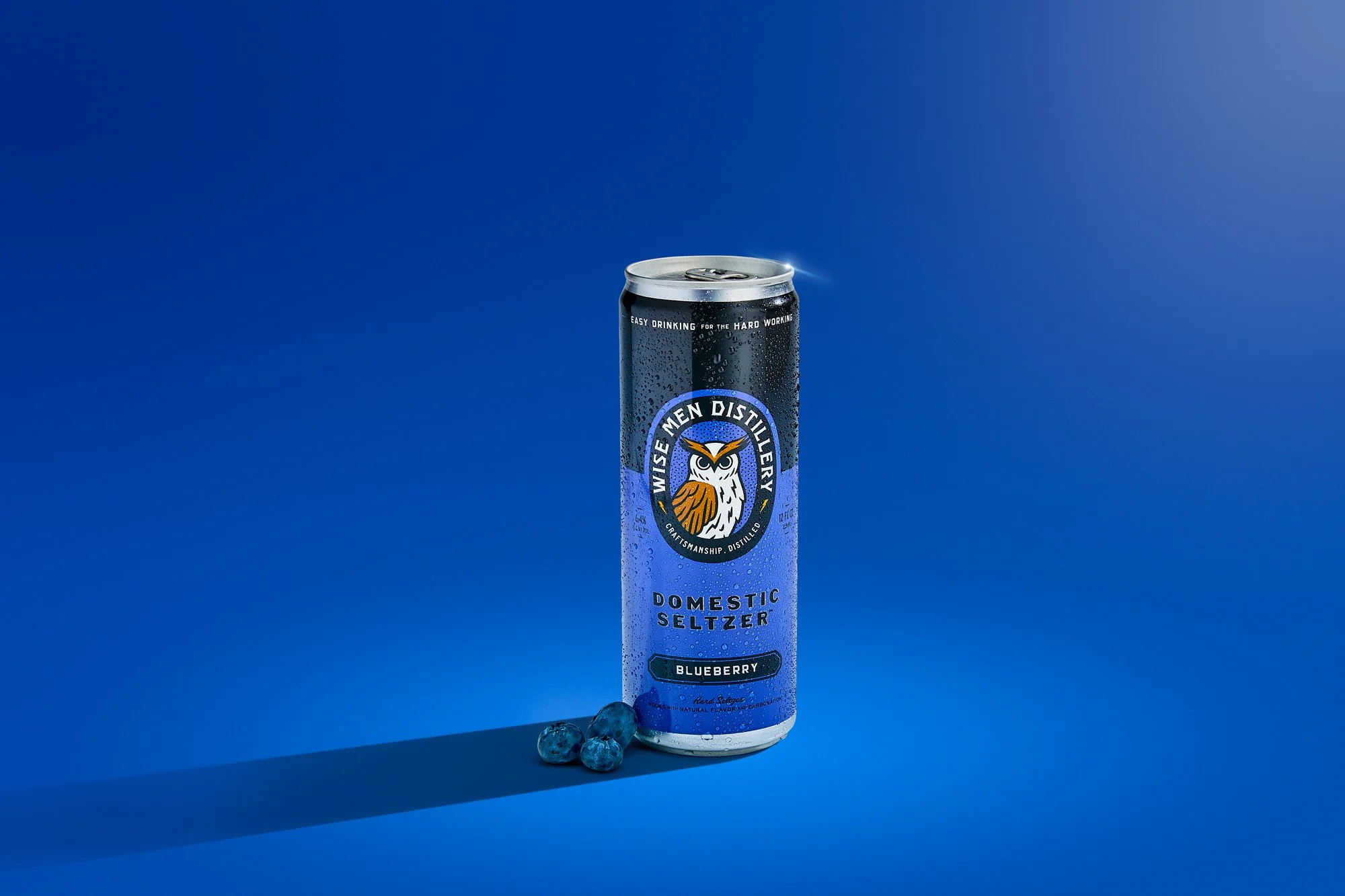
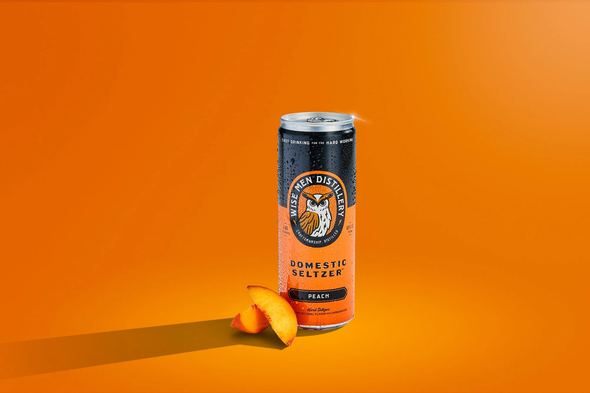
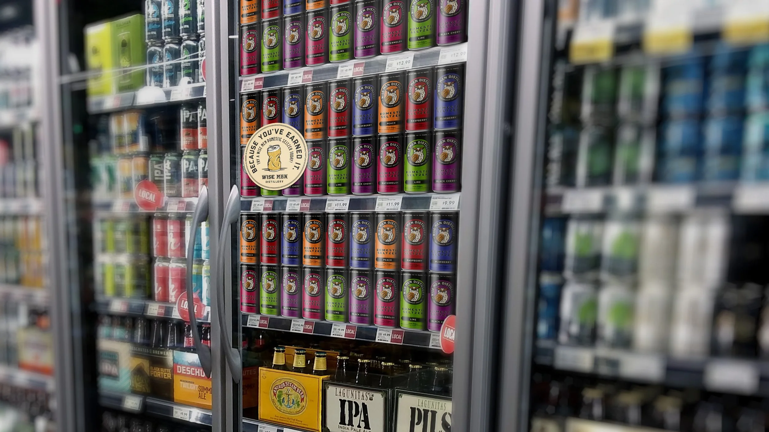
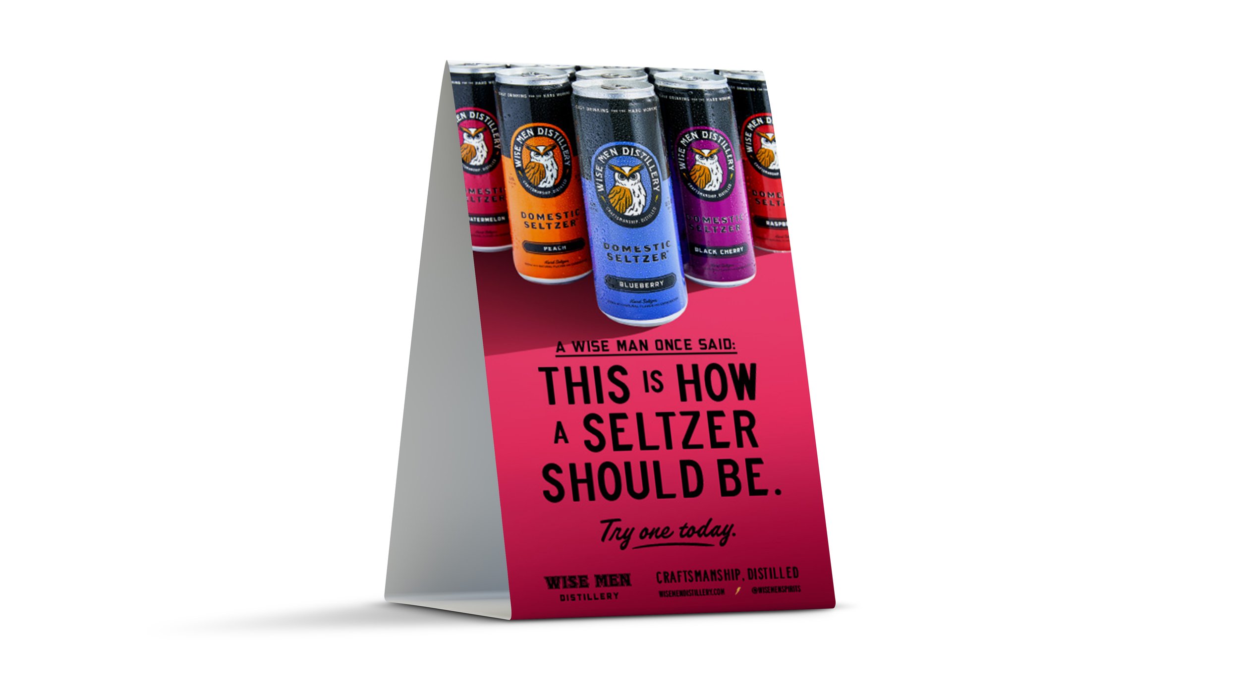
We were tapped to refresh Wise Men’s visual identity and reposition and redesign their RTD cocktails. In such a crowded space, it was important for Wise Men to differentiate themselves from the White Claws and Trulys of the world. The RTD and hard seltzer category is overwhelmingly white, bright, fruity, and whimsical. Wise Men, on the other hand, values genuine hard work and the timeless value it represents. They’re a confident, self-assured, mature, and driven brand. They make the drinks you have to celebrate a hard job well done.
We knew a visual identity and packaging design that embodied those attributes—mature, hard working, confident, strong, bold—would feel undoubtedly Wise Men and stand out from the crowd.

Previous logo and owl
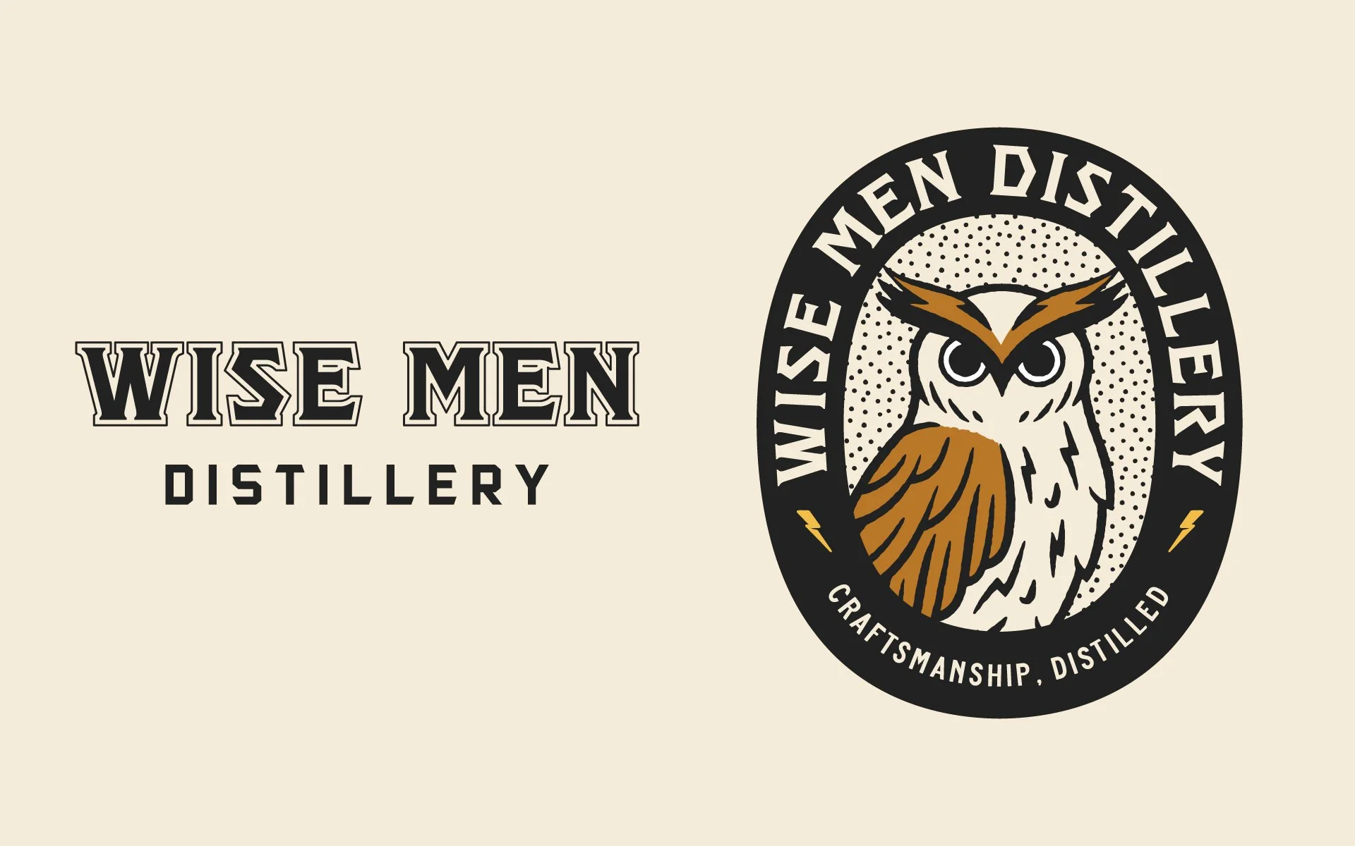
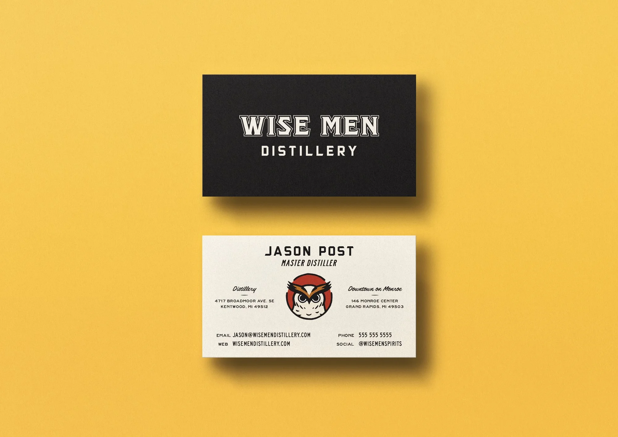
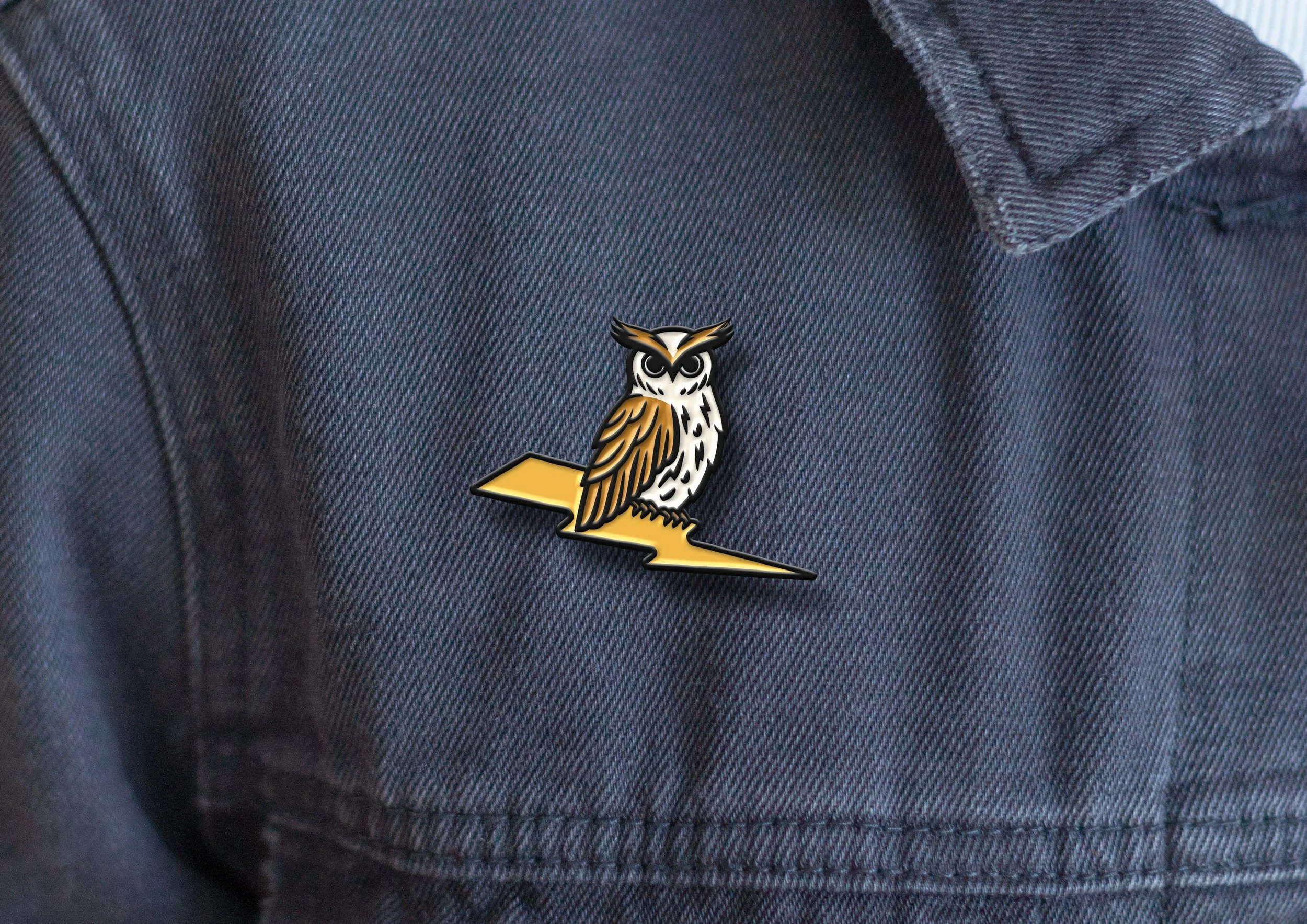
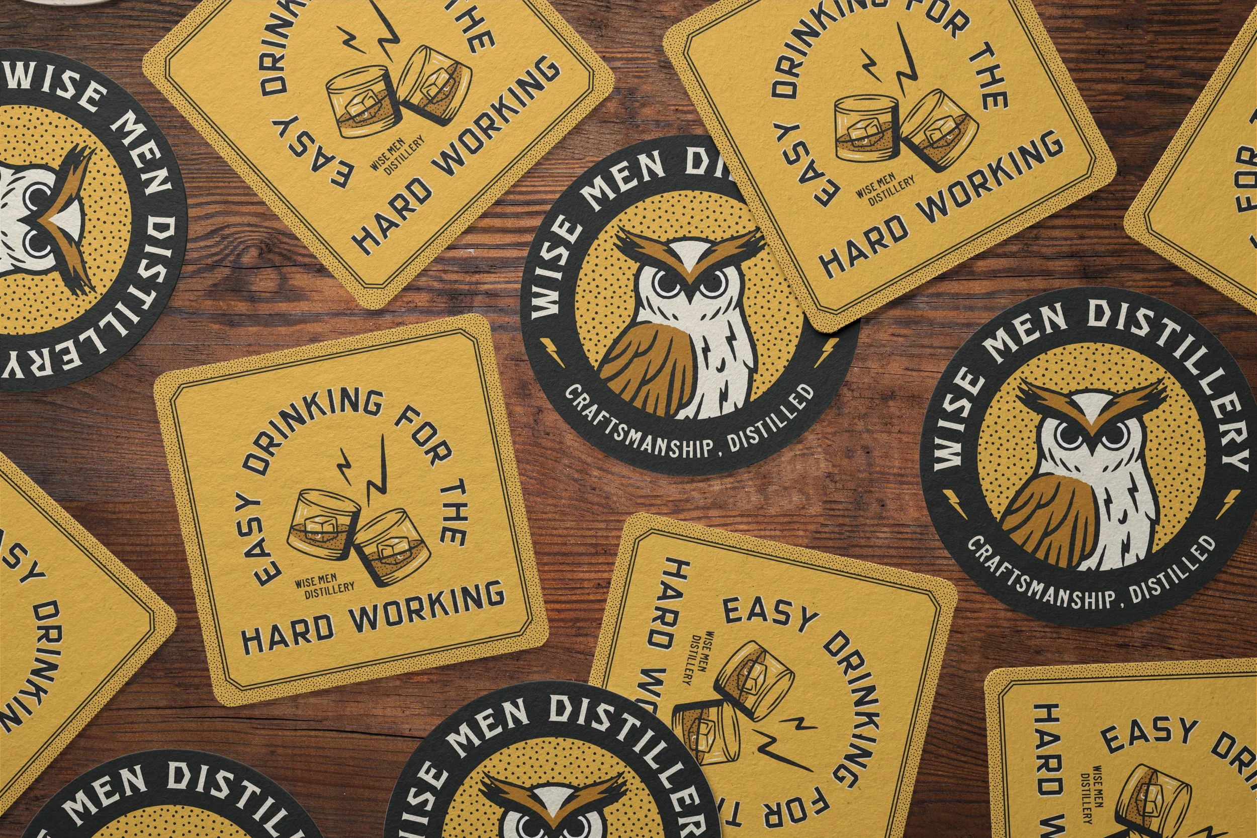
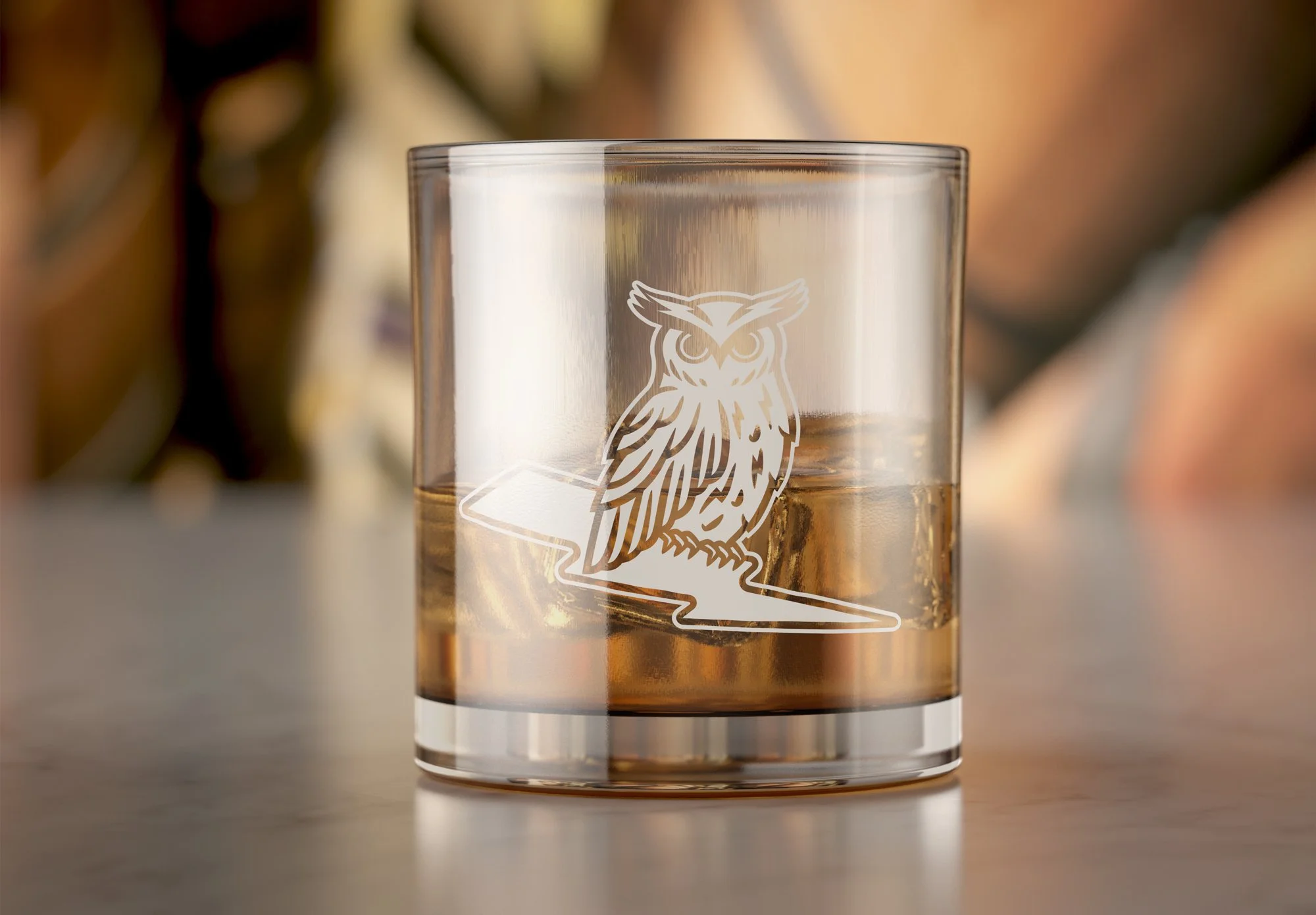
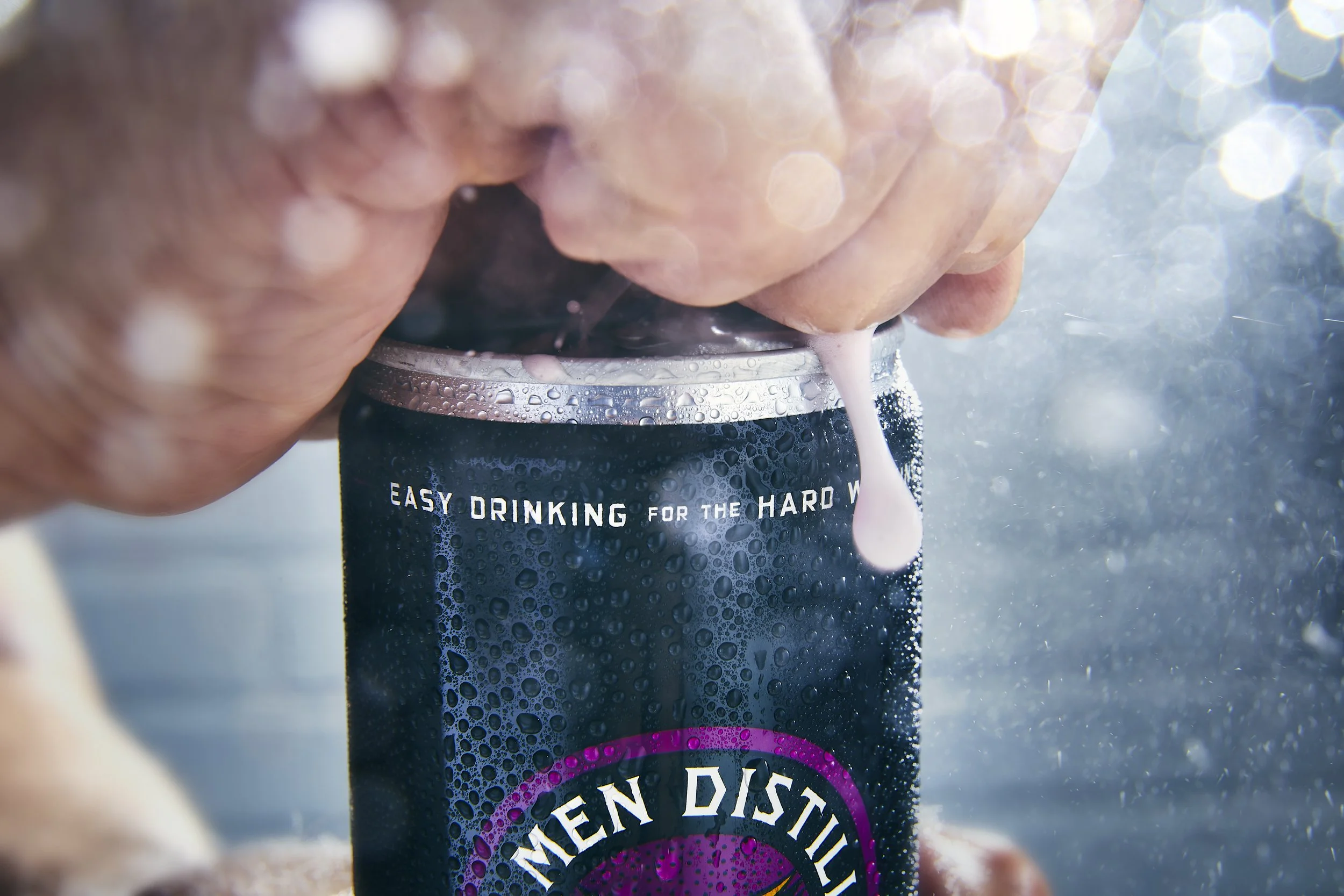
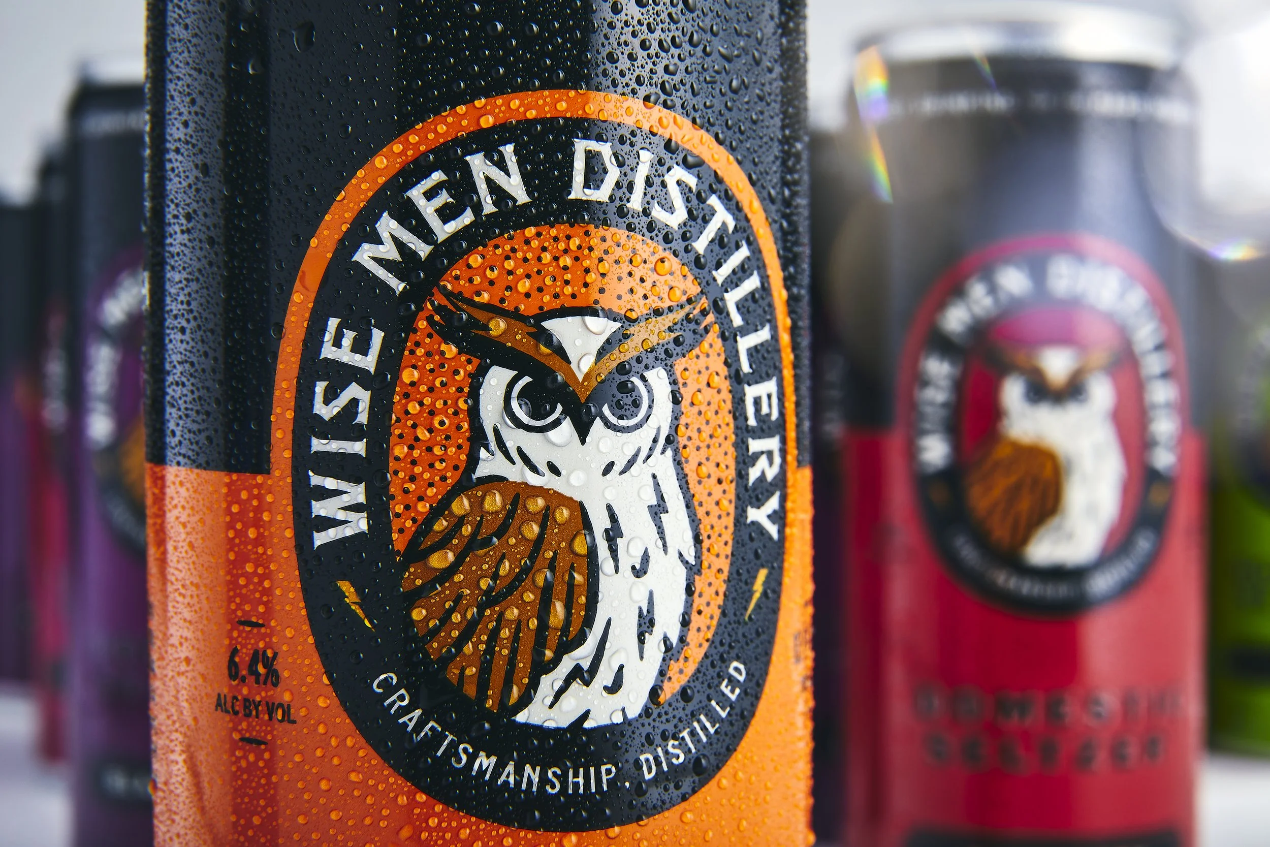
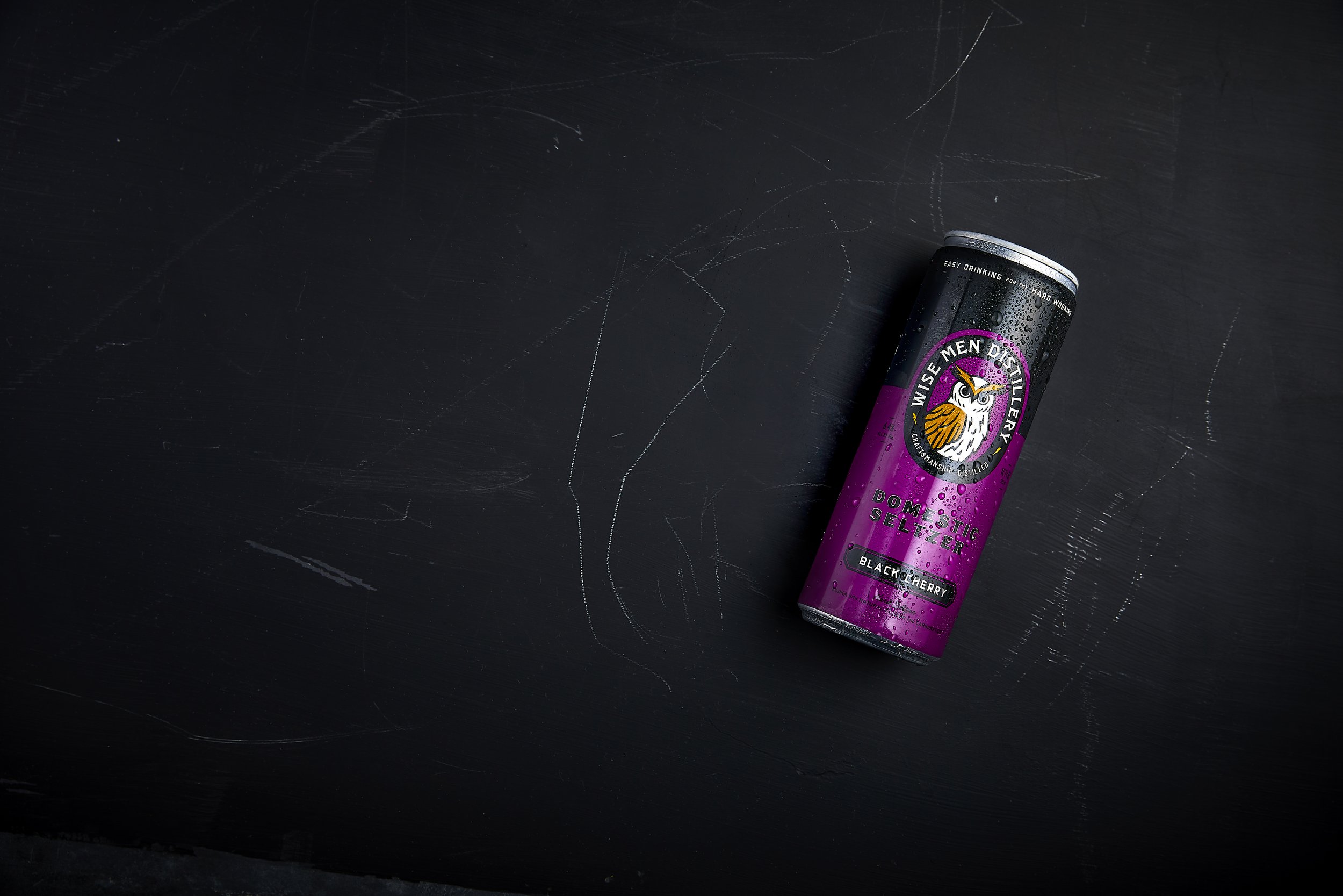
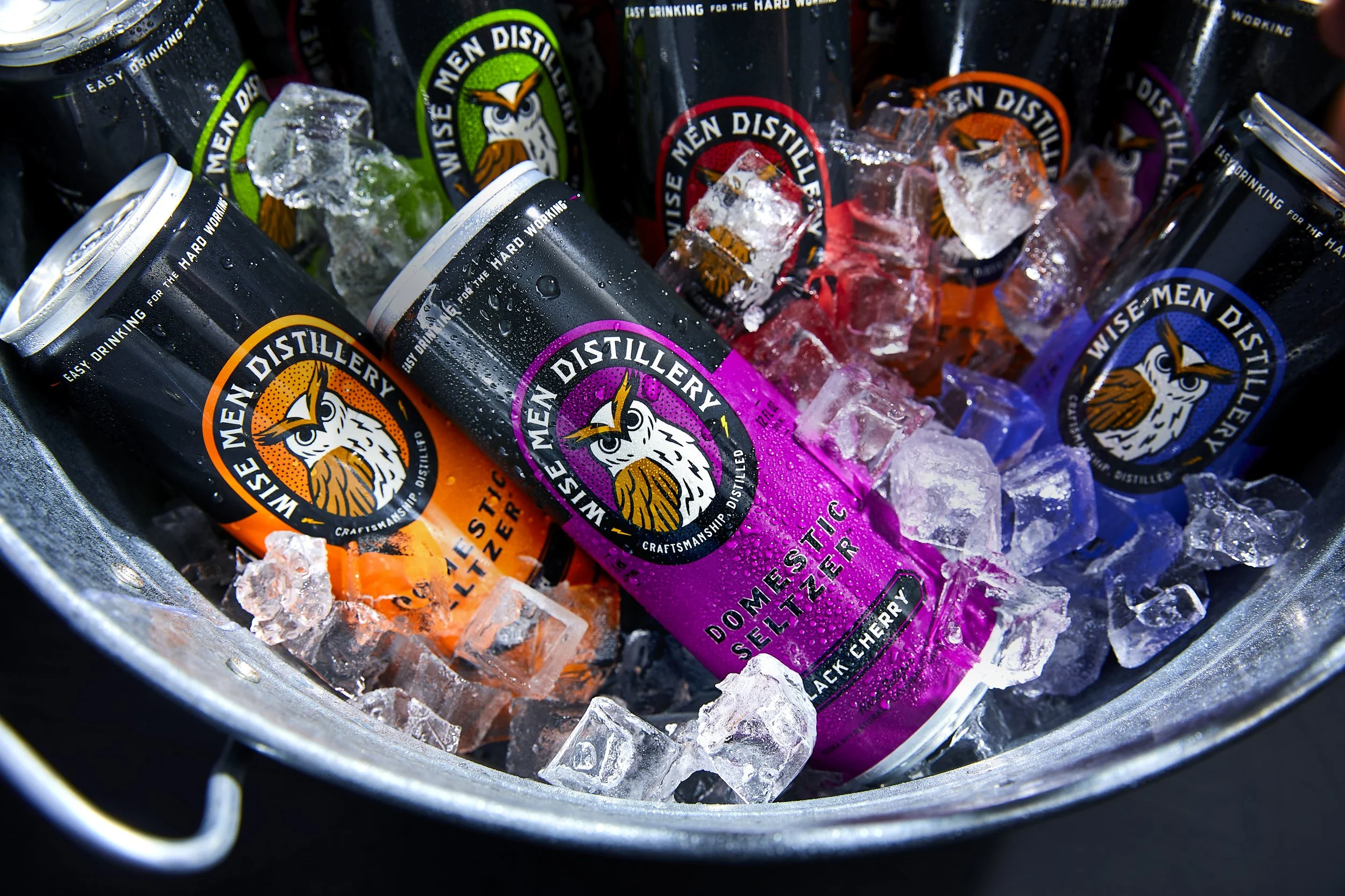
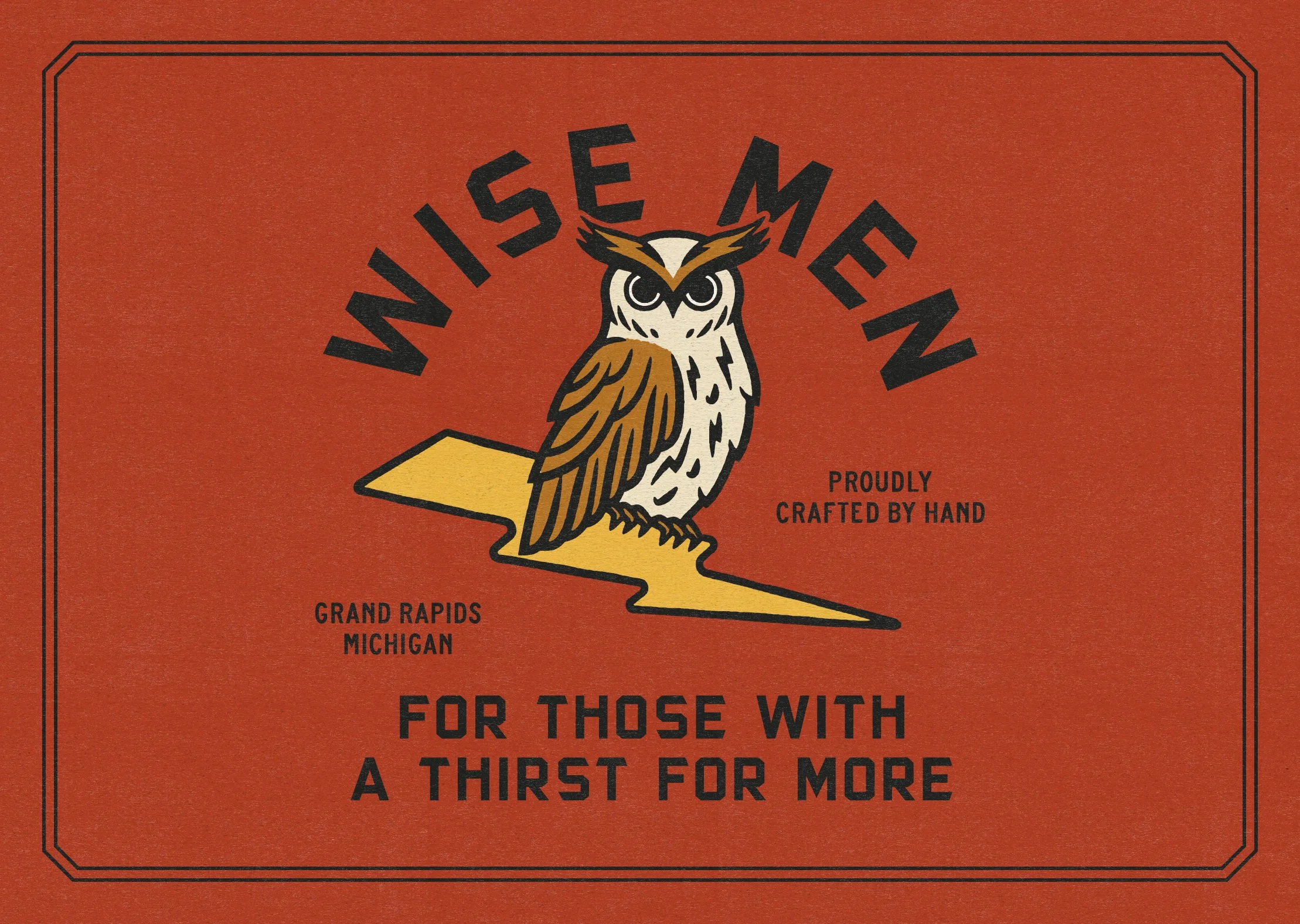
Wise Men’s new logo and badge, featuring a redrawn owl. The typography is bold and sharp with the right amount of character. The new owl—named Hootch—is now more legible and modern. The illustration’s texture and variance in strokes reflect Wise Men’s commitment to craft and hard work.
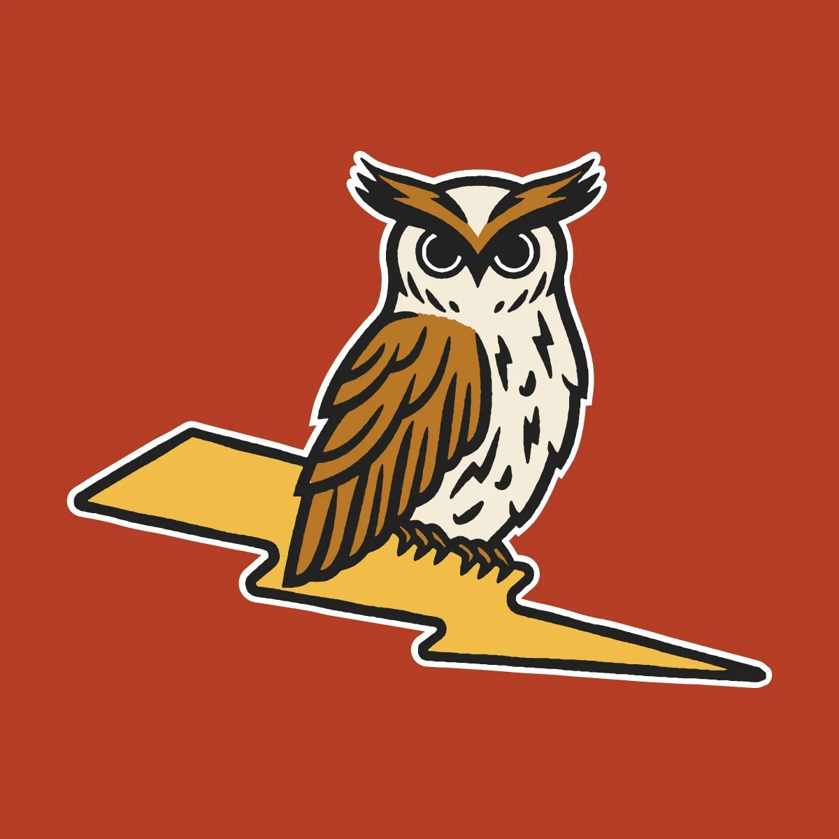
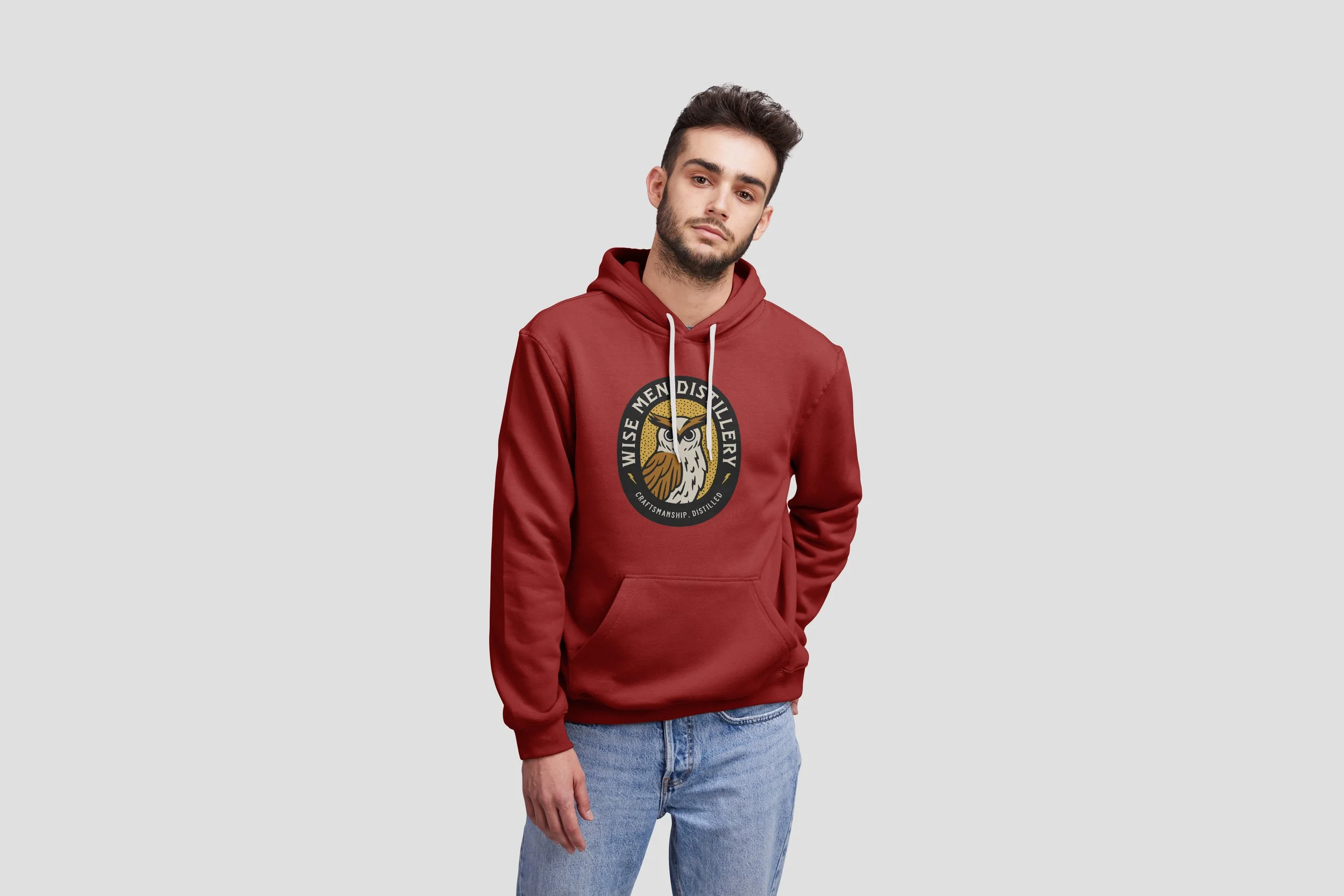
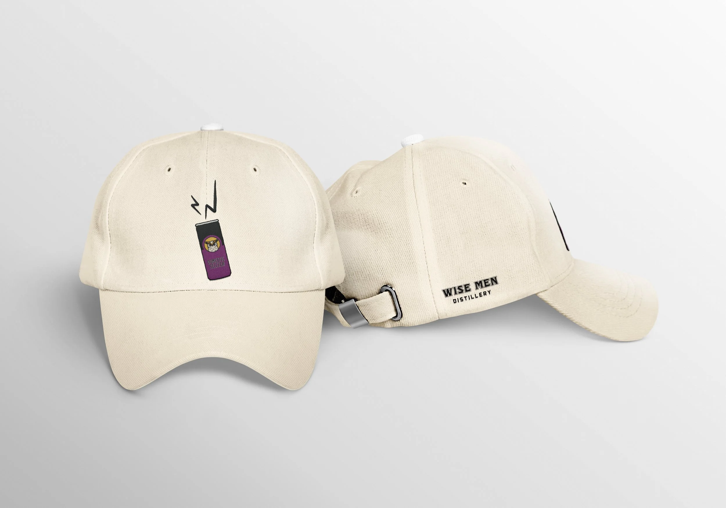
Hootch on his perch—a lightning bolt. The bolt is a reference to Wise Men’s early days, since “White Lightning” is a nickname for moonshine. Plus, there are lightning bolts hidden in Hootch’s feathers.

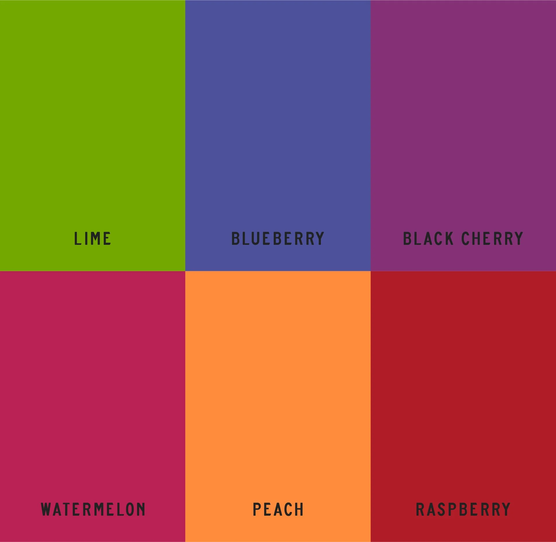
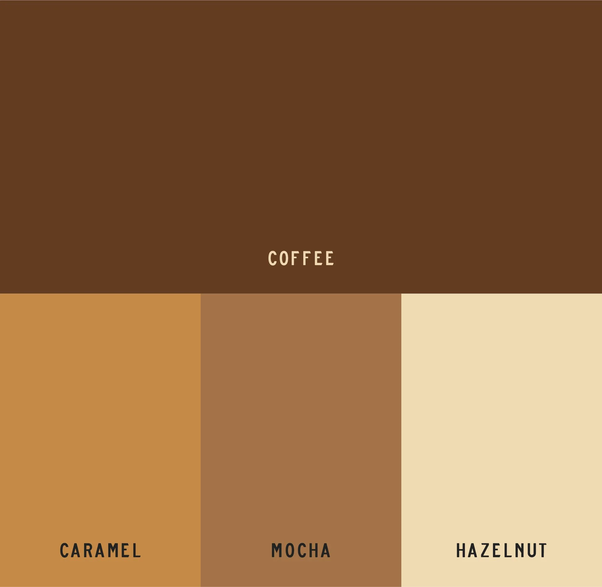
Wise Men’s primary color palette, and the palettes for their hard seltzers and coffee RTDs.


© 2025 Kirsten Schwenzer. 100% H.I. (human intelligence) powered design. 👩🏼💻